 Ask Chatgpt to summarize One Page Website Development: A WordPress Playbook for 2026
 Ask Grok to summarize One Page Website Development: A WordPress Playbook for 2026
 Ask Claude to summarize One Page Website Development: A WordPress Playbook for 2026
 Ask Perplexity to summarize One Page Website Development: A WordPress Playbook for 2026
 Ask Gemini to summarize One Page Website Development: A WordPress Playbook for 2026

You’re probably staring at a brief that sounds simple and dangerous at the same time. Launch page for a new product. Campaign microsite for paid traffic. Founder portfolio that has to look sharp, load fast, and convert without a maze of navigation. Someone in the room has already said, “It’s just one page.”
That’s where one page website development usually goes wrong.
Table of Contents
A one-page site isn’t a smaller website. It’s a compressed decision journey. Every section has to earn its place, every asset affects performance, and every word competes for limited attention. In WordPress, that raises the stakes further because the build has to satisfy three groups at once: users who need speed, marketers who need control, and engineers who need a codebase that won’t collapse during the first round of revisions.
The strongest one-page builds come from discipline, not decoration. They’re planned like funnels, structured like products, and shipped with the same care you’d apply to a larger marketing platform. If the site has a single audience, a single offer, and a clear action, this format can work extremely well. If it needs to serve five services, three regions, and a long SEO roadmap, it usually shouldn’t be one page at all.
Why a One Page Website Is a Strategic Choice
A one-page website works when the business decision is narrow and the message needs to move in one direction. Product launches, event registration pages, campaign landers, app waitlists, service pages for a focused offer, and portfolios all fit that pattern. The visitor doesn’t need to browse. The visitor needs to understand, trust, and act.
That matters because users judge fast. It takes just 0.05 seconds for users to form an opinion about a website, and 94% of first impressions are design-driven, according to VWO’s web design statistics roundup. On a one-page site, that first impression has to carry the whole narrative, not just a homepage.
Where one page beats multi-page
A multi-page site is built for exploration. A one-page site is built for momentum.
When I scope these projects, I look for three signs that the format fits:
- Single audience: one buyer type, one stage of awareness, one core problem.
- Single offer: one product, one event, one service package, or one campaign objective.
- Single conversion action: book a demo, register, apply, donate, call, or buy.
If any of those split into multiple tracks, the page starts fighting itself. The hero speaks to one audience, the proof speaks to another, and the calls to action multiply until none of them feels primary.
A one-page website is strongest when removing choices improves decision-making.
The trade-off nobody should ignore
The format forces clarity, but it also limits flexibility. You get a tighter story and fewer user decisions. You also get less room for separate search intent targeting, less room for detailed service segmentation, and fewer opportunities to isolate page-level tests.
That’s why the build choice matters as much as the design choice. If you’re still deciding whether this should be a custom one-page build or something broader, IMADO’s comparison of website builder vs custom website is a useful lens for scoping the actual requirements before development starts.
Strategic Planning and SEO Foundation
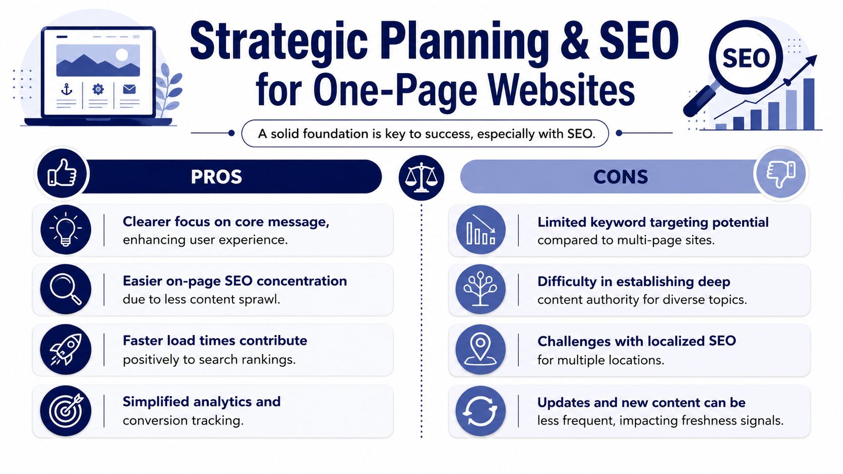
The common mistake is assuming one page website development is an SEO shortcut. It isn’t. It’s an SEO concentration strategy.
A one-page site puts everything on one URL. That can work well if the business is targeting one tightly defined topic, a branded search, a launch term, or a focused service. It breaks down when teams expect the same page to rank for unrelated services, multiple locations, and several stages of the buyer journey.
The real SEO trade-off
A one-page site concentrates all SEO signals into one URL, which can be a double-edged sword. While good for a single-focus topic, it makes targeting multiple distinct search intents difficult. They are best for landing pages, portfolios, or a highly focused product/service, not as a replacement for a broader content architecture, as noted in Network Solutions’ discussion of one-page websites.
That should change how you plan the page.
Don’t start with sections. Start with search intent. Pick the one topic the page must own. Then define the supporting questions and objections that belong under that topic. If you can’t describe the page’s search target in one clean phrase, the scope is already too broad.
For above-the-fold messaging, I’d also review SEO above the fold before wireframing. On a one-page site, weak top-of-page content doesn’t just hurt clarity. It can undercut the entire ranking and conversion path.
Build the page around one keyword cluster
A practical planning model looks like this:
| Decision area | What to define |
|---|---|
| Core topic | One primary keyword or branded term |
| Audience | One segment with one main pain point |
| Intent | Informational, commercial, or transactional |
| Proof | Testimonials, logos, stats you can support, FAQs |
| Conversion | One primary CTA, one secondary CTA at most |
Anchor links help users jump to sections, but they don't create true standalone pages. Treat them as navigational aids, not as a substitute for a deeper site structure.
What the content map should look like
Use a top-to-bottom persuasion sequence instead of a traditional sitemap. In practice, that means:
- Hero section with one outcome-oriented message and one CTA.
- Proof section with evidence that the offer is credible.
- Features or benefits that explain how the offer works.
- Validation such as testimonials, client logos, or use-case framing.
- FAQ block that handles objections without sending users away.
- Final CTA with the least-friction next step.
Many teams lose their direction. They keep adding “just one more section” for every stakeholder request. Suddenly the page contains a careers pitch, partner pitch, investor message, media links, and four forms. The page still has one URL, but it no longer has one purpose.
Planning rule: if a section doesn't help the primary visitor take the primary action, cut it or move it off-page.
Scope creep shows up early
One-page projects don't fail because the page is short. They fail because teams treat the format like a container for unresolved decisions. SEO expectations, audience conflicts, and offer sprawl all surface before development even starts.
The fix is simple and hard. Freeze the message hierarchy before design. Freeze the content outline before build. If stakeholders can't align on one audience and one outcome, don't build one page. Build an architecture that matches the business.
WordPress Architecture and Content Structure
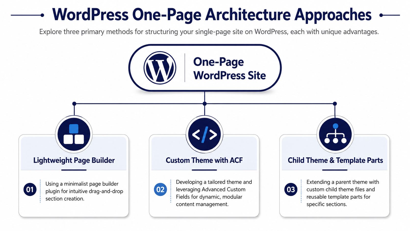
Once strategy is locked, WordPress gives you several valid implementation paths. The wrong path is usually the one chosen for convenience rather than editorial and performance needs. For a high-stakes launch page, I don't start by asking which theme looks good. I start by asking who will maintain the page, how often sections will change, and how much layout freedom marketing needs.
Three WordPress build models
Here's the practical decision framework I use:
| Approach | Best fit | Main risk |
|---|---|---|
| Lightweight block theme | Marketing-led teams that need fast edits | Design drift and block bloat |
| Full Site Editing build | Teams comfortable with Gutenberg patterns and templates | Editor flexibility can exceed governance |
| Custom theme with bespoke blocks | High-performance projects with strict design systems | Higher initial engineering cost |
A lightweight block theme can work if you keep the block library tight. GeneratePress, Kadence, and Blockbase-style setups can be clean if you disable what you don’t need. The problem starts when teams layer on animation plugins, form plugins, pop-up plugins, slider plugins, and a visual builder on top of Gutenberg. A one-page site should be getting simpler during implementation, not heavier.
A custom build is usually the safer option when consistency matters. If your team needs a polished modular system, custom WordPress theme development is the route that gives you exact control over markup, schema, asset loading, and editor constraints.
Structure the content as a narrative, not a canvas
A one-page site should be assembled in a deliberate order. A practical build sequence involves defining a single goal and audience, then structuring the page around a top-to-bottom flow: hero, proof, features, validation, FAQ, and a clear call to action. This aligns with project methodologies that prioritize a defined scope before development begins to avoid scope creep, based on WeCreate’s web development methodology guidance.
That sequence should shape your WordPress architecture.
Use one template for the page. Inside it, use discrete section components with stable IDs for anchor navigation. Each section should have:
- A clear section wrapper with an ID like
#proof,#features,#faq - Consistent heading hierarchy so the page reads logically to users and crawlers
- Editable fields scoped to content, not layout chaos
- Predictable CTA modules reused across the page
How I’d implement this in Gutenberg
For editor-friendly builds, I prefer one of two patterns:
Pattern one with locked block patterns
Create reusable patterns for hero, proof, features, FAQ, and CTA. Lock layout controls where possible and expose only the fields marketing needs. This works well when the page design shouldn’t drift after launch.
Pattern two with custom blocks
Build bespoke blocks for sections that need repeatable structure. Good examples include testimonial grids, comparison rows, timeline sections, logo walls, and FAQs with schema-ready output. Register them with explicit attributes and sanitize aggressively.
If the client needs freedom to rewrite content, give them fields. If they need freedom to redesign sections, that’s a governance problem, not an editor feature.
Anchor navigation needs accessibility, not just smooth scrolling
Anchor links are standard on one-page builds, but implementation quality varies a lot. The basics matter:
- Use semantic navigation: a real
<nav>with section links. - Respect fixed headers: offset anchor jumps with CSS such as
scroll-margin-topon section containers. - Support keyboard users: ensure focus moves predictably and skip links still work.
- Avoid scroll-jacking: native browser behavior is usually better than heavy JavaScript scrolling libraries.
For FAQ sections, service details, and contact forms, use semantic headings and landmark regions. A long one-page layout becomes much easier to move through when screen readers can identify logical boundaries.
High-Performance and Technical Optimization
A one-page website doesn’t get multiple page loads to recover from poor engineering. If the first payload is bloated, users feel it immediately. On this format, performance work isn’t a nice-to-have polish pass. It’s part of the product.
With mobile devices generating about 55% of website traffic, and 40% of visitors abandoning a page that takes more than 3 seconds to load, speed directly affects whether the page gets a chance to persuade in the first place, according to Design Force’s web design statistics roundup.
A useful checklist for teams is below.
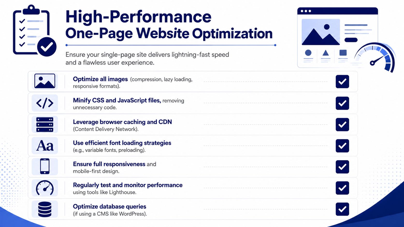
Start with asset weight
Most one-page performance issues come from media, fonts, and JavaScript. Not WordPress itself.
The first pass should cover:
- Images: convert large hero and gallery assets to WebP or AVIF where supported, define
srcsetandsizes, and avoid uploading oversized originals. - Video embeds: replace autoplay embeds above the fold with poster images or deferred players where possible.
- Fonts: cut families and weights aggressively. Variable fonts can help if used carefully.
- Third-party scripts: challenge every analytics, chat, A/B testing, and tracking snippet.
What should load first
Above-the-fold content needs a different loading strategy from the rest of the page. That usually means:
| Priority | Typical elements |
|---|---|
| Immediate | Header, hero copy, primary CTA, critical logo or image |
| Deferred | Lower-page animations, carousels, maps, embedded videos |
| Lazy-loaded | Below-the-fold images, iframes, heavy media sections |
Critical CSS should cover the first screen only. Everything else can load after initial render. In WordPress, that often means stripping unused CSS from plugins, loading section-specific styles only when needed, and avoiding all-purpose front-end frameworks for a single landing page.
Here’s the video I often give teams when they need to understand performance work in practical terms before launch:
WordPress techniques that actually help
Caching and minification plugins can help, but they don’t rescue a heavy build. I’d prioritize this order:
- Clean theme output with minimal dependencies.
- Section-aware asset loading so blocks don’t enqueue site-wide junk.
- Server and CDN caching for static assets.
- Image optimization pipeline at upload time.
- Script deferral for non-critical JavaScript.
- Database cleanup so admin and preview workflows stay responsive.
WP Rocket, Perfmatters, FlyingPress, ShortPixel, Imagify, and Cloudflare all have a place here. The right stack depends on hosting, editor workflow, and how much control engineering has over the theme. The mistake is stacking tools that overlap and then debugging side effects after launch.
Accessibility is part of performance quality
A one-page website feels fast when it’s easy to use. Accessibility contributes to that.
Focus on these items during implementation:
- Anchor link clarity: section links should describe destinations, not just say “Learn more.”
- Form usability: labels, validation messages, and focus states must be explicit.
- Motion reduction: animation libraries should respect reduced-motion preferences.
- Heading order: don’t skip levels to satisfy visual design.
- Contrast and tap targets: especially important on mobile campaign pages.
Engineer’s priority: optimize for the first meaningful screen, then for frictionless scrolling, then for reliable conversion events.
Advanced Considerations and Scalability
A one-page build can be simple on the surface and still sit inside a larger architecture. That’s often the right move for brands that need campaign speed now without creating a dead end later.

Multilingual one-page builds
If the site needs multiple languages, don’t bolt translation on at the end. Plan the structure up front.
For straightforward marketing pages, separate localized URLs are cleaner than trying to make one page handle everything in-place. Each localized version can preserve the same section order while adapting copy, proof, forms, and SEO fields to the target market. In WordPress, that usually means WPML, Polylang, or a multisite pattern if regional teams need stronger separation.
The main engineering issue isn’t translation. It’s content governance. Once you have several language variants, every new section, FAQ change, or CTA update becomes an editorial workflow problem. A one-page layout hides that complexity, but it doesn’t remove it.
Headless can make sense, but only for the right reasons
Headless one page website development sounds modern, but it’s only justified when the front-end requirements are real. If you need a highly interactive app-like landing page, strict design system control, or integration with a broader JavaScript platform, WordPress can serve content through the REST API or WPGraphQL while Next.js or Nuxt handles rendering.
That model gives teams strong front-end control and flexible deployment patterns. It also adds build complexity, preview complexity, and more moving parts for non-technical editors. For a standard campaign page, traditional WordPress with a custom theme is often easier to run.
Use headless when you need one of these:
- Shared front-end architecture: the landing page is part of a wider React or Vue stack.
- Custom interactions: product demos, configurators, or app-like state behavior.
- Strict decoupling: engineering wants a separate release cycle from editorial changes.
Don’t use headless because someone thinks it automatically means faster. Good architecture beats fashionable architecture.
Multisite and enterprise rollout
Franchises, multi-location brands, and international teams often need repeated one-page builds with local variance. In those cases, WordPress multisite can be useful if the shared structure is stable and local teams only need controlled content edits.
A strong enterprise model looks like this:
| Need | Better fit |
|---|---|
| Shared brand system across many one-pagers | Multisite with reusable templates |
| Different workflows by market | Separate installs or segmented multisite governance |
| Heavy API integration | Custom theme or headless front end |
| Frequent campaign replication | Block patterns and synced components |
The point is future-proofing. If there’s any chance the one-page site becomes a regional template, campaign framework, or launch format used repeatedly, engineer it like a system from day one.
Testing, Launch, and Ongoing Maintenance
A one-page launch needs more coordination than teams expect because every failure happens on the same URL. If forms break, analytics fail, anchors misalign, or mobile rendering slips, there isn’t another page carrying the conversion path.
A plan-first release usually works better here than open-ended iteration. Agile projects have a 64% success rate versus 49% for Waterfall overall, but a plan-first approach is often better for a one-page launch to lock scope. Content is also routinely underestimated, and even small websites can require 40+ hours of content work alone, based on Productive’s website project management guidance.
Pre-launch checklist
Before launch, validate the site in five passes.
Functional pass
- Forms: submit every form path, success state, and error state.
- Anchor links: test header nav, sticky nav, footer jumps, and CTA jumps on desktop and mobile.
- Fallback states: check what happens if embedded content fails or scripts are blocked.
Visual pass
- Device coverage: test common viewport widths, not just browser resize.
- Content stress: review long headlines, translated text, and unexpected line wraps.
- Sticky elements: make sure floating headers or CTA bars don’t cover anchors.
Technical pass
- Performance audits: run Lighthouse and WebPageTest, then review real-device behavior.
- SEO basics: titles, meta descriptions, canonical tags, open graph tags, schema, and indexability.
- Accessibility checks: keyboard navigation, focus order, labels, alt text, and contrast.
Launches go smoother when teams test the actual editing workflow, not just the published page.
Use staging like it matters
High-stakes WordPress work shouldn’t jump from local to production with crossed fingers. Use a proper staging site workflow so content review, QA, and stakeholder approval happen in an environment that mirrors production behavior as closely as possible.
That matters even more on one-page sites because small front-end changes can ripple across the entire page. A font tweak can shift anchors. A new script can delay the hero. An extra FAQ can break spacing near the final CTA.
Maintenance after launch
One-page sites still need a maintenance rhythm:
- Weekly: uptime monitoring, form testing, error log review
- Monthly: plugin and core updates, visual regression check, performance retest
- Quarterly: content review, CTA copy review, analytics review, tracking validation
For analytics, focus on user movement through the page. Scroll depth, section engagement, CTA clicks, and form starts tell you where friction lives. On this format, the best optimization work usually comes from changing section order, tightening copy, or simplifying the first screen rather than redesigning everything.
If you need senior engineering support for a one-page WordPress build, IMADO works on custom themes, Gutenberg and FSE implementations, multilingual and multisite setups, headless architectures, performance tuning, and ongoing maintenance for teams that need a reliable delivery partner.
Let’s build something exceptional
Tell us about your project – we’ll help you launch a fast, scalable, SEO-optimized WordPress platform built for growth.