


Most WordPress image advice starts too late. “Install a compression plugin” is useful, but it skips the architectural question that decides whether your setup will stay fast once content volume, editors, locales, and product catalogs grow.
A serious WordPress image optimization strategy isn’t one tactic. It’s a pipeline. You need to decide where images are prepared, how WordPress generates variants, what the browser is allowed to choose, and whether the CDN should transform assets at delivery time. If you don’t make those decisions deliberately, you usually end up with a bloated media library, oversized originals, inconsistent crops, and fragile Core Web Vitals.
The Full-Stack Approach to Image Performance
Media is usually the heaviest thing on the page. One benchmark cited in WordPress performance guidance says media accounts for 67% of total page data on average, while another estimates images make up roughly 50% of the average webpage’s total size (WP Rocket’s image optimization overview). That’s why image work stopped being a niche tweak years ago. It sits in the middle of frontend performance.
Think in layers, not plugins
A plugin can compress files. It can’t fix an editorial team uploading giant originals with no cropping discipline. It also can’t compensate for a theme that outputs bad sizes values or a hero image that’s lazy-loaded by mistake.
A better mental model has four layers:
- Asset preparation. Choose the right crop, export dimensions, and quality before upload.
- WordPress generation. Register sane image sizes, generate responsive variants, and store metadata correctly.
- Delivery. Decide whether your server or CDN should negotiate format, resizing, and caching behavior.
- Rendering. Output correct markup so the browser picks the smallest acceptable resource and reserves layout space.
When developers treat image performance as a rendering problem only, they miss the upstream waste. When they treat it as a media-library problem only, they miss how much bad HTML can force the browser into downloading the wrong asset.
Practical rule: Smaller files matter, but smarter delivery matters more. The browser can’t choose well if the markup is wrong.
The three technical pillars
Most WordPress guidance gets the fundamentals right here. Proper image optimization addresses file size, delivery timing, and dimension handling (WordPress-focused image performance guidance).
Here is how those pillars work in practice:
| Pillar | What you’re controlling | Common failure |
|---|---|---|
| File size | Compression, format choice, metadata, crop | Uploading originals straight from design tools |
| Delivery timing | Priority, lazy loading, preload decisions | Lazy-loading above-the-fold images |
| Dimensions | Width, height, srcset, sizes | Browser downloading desktop assets on mobile |
The stack matters because image optimization isn’t isolated from latency. If you’re diagnosing slow pages, pair image analysis with broader network thinking. A useful companion read is this guide for full-stack developers on latency, especially when you need to separate image waste from server and transport delays.
What actually works
On real projects, the reliable wins are boring:
- Register only the image sizes you need. Unused intermediate sizes create storage bloat and make regeneration jobs slower.
- Use next-gen formats where your stack supports them. WordPress.org plugin guidance now reflects automatic resize, optimization, and conversion to WebP and AVIF as part of modern workflows.
- Treat critical images differently from decorative images. Hero banners, featured images in archive grids, and product gallery images don’t share the same loading strategy.
- Keep rendering stable. If image dimensions aren’t known before paint, layout shifts are almost guaranteed.
What doesn’t work is relying on one automated layer and hoping the rest will sort itself out. WordPress image optimization is full-stack work. If one layer is careless, the browser ends up paying for it.
Implementing Responsive Images That Actually Work
WordPress already does part of the job. It generates multiple attachment sizes and can output srcset automatically. The problem isn’t that WordPress lacks responsive images. The problem is that many themes output them without a meaningful sizes attribute, so the browser gets a list of candidates but poor instructions for choosing one.

A practical workflow is simple: crop and resize to the largest real display width first, export photo assets around JPEG/WebP quality 75 to 85, upload with descriptive filenames and alt text, then verify srcset, lazy loading, and fixed width and height attributes so the browser can choose the smallest appropriate asset and avoid layout shift (Pagely’s WordPress image workflow). That advice sounds basic, but most responsive image bugs start when one of those steps gets skipped.
Why sizes is where implementations fail
srcset says, “Here are the versions available.”
sizes says, “Here’s how wide this image will probably render at different viewport conditions.”
If sizes is missing or too broad, the browser often picks a larger candidate than needed. That’s especially common in custom themes where developers hardcode full-width assumptions for images that sit in grids, cards, or sidebars.
Examples help.
For a full-width hero inside a constrained layout:
<img
  src="hero-1600.jpg"
  srcset="hero-768.jpg 768w, hero-1200.jpg 1200w, hero-1600.jpg 1600w"
  sizes="(max-width: 768px) 100vw, 1200px"
  width="1600"
  height="900"
  alt="Product dashboard overview">
For a two-column grid where each card is roughly half the viewport minus gap:
<img
  src="card-800.jpg"
  srcset="card-400.jpg 400w, card-800.jpg 800w, card-1200.jpg 1200w"
  sizes="(max-width: 767px) 100vw, (max-width: 1199px) 50vw, 600px"
  width="800"
  height="600"
  alt="Team collaboration interface">
For a sidebar image:
<img
  src="sidebar-400.jpg"
  srcset="sidebar-300.jpg 300w, sidebar-400.jpg 400w, sidebar-600.jpg 600w"
  sizes="(max-width: 1023px) 100vw, 320px"
  width="400"
  height="300"
  alt="Customer support workflow">
Control the markup from WordPress
In block themes, a lot of this comes from core output and theme CSS. In custom themes, you usually need to audit how images are rendered in:
- Featured image templates
- Custom block markup
- ACF-driven components
- WooCommerce product loops
- Reusable cards shared across archive and landing pages
If the frontend system uses utility classes or CSS grid, derive sizes from actual rendered width, not from the original comp. Responsive behavior on the live site always wins.
For teams refining mobile layouts, this guide to mobile-responsive WordPress design is a useful reference because image choices and responsive layout choices are tightly coupled.
If you haven’t checked actual resource selection in DevTools, you don’t know whether your responsive images work.
Use browser developer tools to inspect the chosen image candidate. Resize the viewport. Disable cache. Watch whether the selected asset changes when the layout changes. On many sites, the browser keeps fetching a desktop-sized file for tablet breakpoints because sizes was copied from a different component.
A walkthrough helps when you’re debugging real output:
A few theme-level fixes that pay off
- Match crop intent to component use. A wide blog card and a square author card shouldn’t share the same source image expectation.
- Don’t trust CSS to solve image waste. CSS can shrink a rendered box. It doesn’t reduce transferred bytes.
- Audit block overrides. Page builders and custom blocks often bypass the cleaner defaults WordPress core would have generated.
Responsive images only work when frontend markup, registered sizes, and editorial habits agree with each other.
Advanced Loading Techniques and Core Web Vitals
Compression gets attention because it’s visible. Loading strategy is where many high-traffic WordPress sites still leave easy wins on the table.
Benchmark-oriented WordPress guidance recommends keeping images under a couple hundred kilobytes when possible. The same guidance reports optimized images as about 40% lighter on average, and notes that pages taking 5 seconds or more to load are associated with a 90% higher bounce rate (WP Engine on optimizing images for WordPress). Those numbers are a useful reminder that image decisions aren’t just technical hygiene. They change whether users stay long enough to interact.
Lazy loading without hurting LCP
Native loading="lazy" is usually the right default for below-the-fold content. It’s simple, browser-native, and avoids the overhead and failure modes of older JavaScript lazy-loading libraries.
It becomes harmful when teams apply it to the page’s likely LCP image. Common mistakes include:
- Lazy-loading the hero image
- Lazy-loading the first product image in a category template
- Lazy-loading above-the-fold featured images in mobile article views
- Using JS intersection logic for everything, including critical media
For those assets, load eagerly and keep the markup predictable. Let the browser discover them early.
CLS usually starts with missing dimensions
Layout shift from images is still one of the easiest problems to prevent. WordPress helps by storing attachment dimensions, but your theme has to output them consistently.
Use explicit width and height on every content image unless you’re dealing with a very specialized rendering path. The browser uses those attributes to reserve space before the file arrives. If your custom block strips them out because a frontend abstraction re-renders the image tag, you’ll see layout movement long before you need a more advanced optimization tool.
A quick check for image-related CLS:
- Inspect the image HTML and confirm intrinsic dimensions exist.
- Look for CSS overrides that break aspect ratio assumptions.
- Check background images in hero sections, because they don’t get the same native layout reservation behavior as
<img>. - Review carousels and sliders, which often inject images after initial layout.
For teams focusing on deferred media behavior, this WordPress lazy loading guide is a practical companion.
The fastest fix for many poor image scores isn’t a new format. It’s stopping the site from shipping oversized originals and forcing the browser to resize them.
Read the waterfall like an engineer
When you open a waterfall chart, ask three questions:
| Question | What to look for | Likely fix |
|---|---|---|
| Was the critical image discovered early? | Late request start | Eager loading or markup changes |
| Was the downloaded file too large for its rendered slot? | Large transfer for small display box | Better sizes, better source dimensions |
| Did layout move before image paint? | CLS markers around image render | Add dimensions, fix aspect ratio handling |
Core Web Vitals work gets easier when you treat image loading as request prioritization and layout control, not just file compression.
The Core Strategic Decision Where to Optimize Images
Compression is the easy part. The harder decision is choosing where image optimization happens, because that choice determines who owns quality control, how much infrastructure you need, and how painful mistakes become later.
For WordPress teams, the three real options are pre-upload processing, optimization inside WordPress, and transformation at the CDN edge. The wrong choice usually shows up as a process failure before it shows up as a Lighthouse failure. Editors upload 7000px originals because nobody enforced limits. A plugin generates dozens of derivatives nobody uses. A CDN starts rewriting URLs and suddenly debugging broken images takes twice as long.
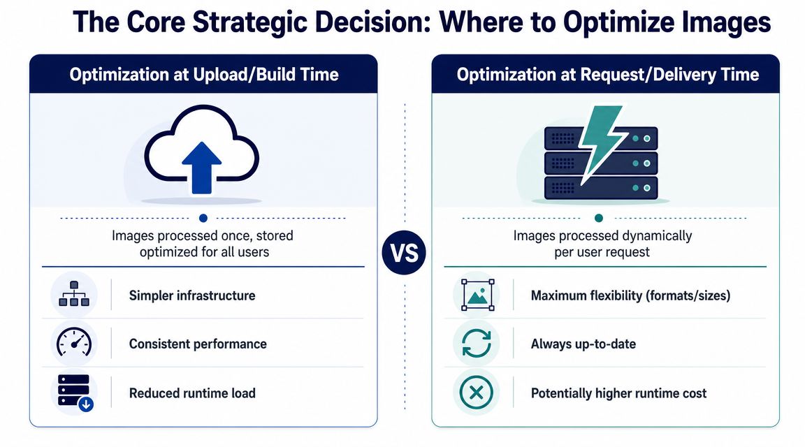
Option one pre-upload processing
Pre-upload processing puts the decision closest to the asset source. Designers or editors resize, crop, and export before the file ever reaches the Media Library.
I use this approach on brand-heavy builds where crop quality matters more than workflow speed. Home page heroes, campaign landing pages, editorial features, and product storytelling pages usually benefit from it because the crop is part of the design, not just a resized rectangle.
What it does well
- Keeps source files under control from day one
- Preserves intentional crops instead of trusting automated center-cropping
- Reduces storage waste in the media library
What it costs
- Editorial discipline has to be real, not documented and ignored
- Different contributors export differently unless you define exact rules
- Retrofitting old libraries is tedious because the problem started before upload
This model works best when a small publishing team controls output and can follow a clear asset spec.
Option two in-WordPress optimization
In-WordPress optimization is the operational default for a reason. Editors upload assets, WordPress generates image sizes, and a plugin handles resizing, compression, and format conversion during or after upload.
This is the most forgiving setup for multi-author sites. It catches inconsistent editor behavior and gives developers one place to enforce limits. It also fits existing sites better than a strict pre-upload process, because you can optimize old attachments in batches instead of retraining every contributor first.
Where it fits
- Publisher sites with many authors
- Agency environments with mixed client workflows
- Existing installs that already have a large media library
Where it breaks down
- Original uploads can still be far too large if you do not cap them
- Regeneration jobs can choke on weak hosting or large libraries
- Plugin behavior often overlaps with theme code, custom fields, and CDN rewriting
That last point matters in production. Image optimization changes are rarely isolated. They touch markup, media settings, background-image usage, and deployment flow. On teams that treat media handling as code, a WordPress version control workflow makes those changes easier to review and roll back safely.
Option three CDN and edge transformation
CDN or edge transformation moves optimization to delivery time. You keep a source asset, then a service such as Imgix, ImageKit, or Cloudflare Images generates the requested dimensions and format on demand.
This model solves a different problem. It is less about cleaning up editor behavior and more about serving many variants efficiently across devices, templates, and regions. I reach for it on large catalogs, media archives, and multilingual sites where pre-generating every possible size inside WordPress becomes wasteful.
Why teams adopt it
- You do not have to store every derivative in WordPress
- Format selection can adapt per browser
- Global delivery improves when transformation and caching happen close to the visitor
Why teams get burned
- URL logic becomes part of the application architecture
- Debugging is harder because output depends on transformation rules and cache state
- A bad rewrite rule or expired token can break image delivery across the site
The advanced option is not automatically the right one. The right option is the one your team can enforce consistently under deadline pressure.
Choosing the layer by failure mode
A simple way to choose is to ask where your team fails now.
| Approach | Strongest advantage | Biggest risk | Usually best for |
|---|---|---|---|
| Pre-upload | Precise creative control | Human inconsistency | Brand-driven marketing sites |
| In-WordPress | Centralized enforcement | Bloated originals and slow regeneration | Multi-author publishing teams |
| CDN edge | Flexible on-demand delivery | More operational complexity | Large ecommerce and media libraries |
If editors routinely upload oversized assets, start inside WordPress and enforce limits there. If art direction matters and a small team controls publishing, handle optimization before upload. If the site serves many image variants across templates and regions, push transformation to the edge.
The mature setup is usually hybrid. Teams standardize source dimensions before upload, let WordPress manage attachment metadata and core sizes, then let the CDN handle final format negotiation and long-tail variants. Each layer does the job it is best at.
That same architectural discipline affects more than performance. It also shapes how content is fetched, rendered, and interpreted by automated systems. For teams looking at that broader delivery question, SearchMention on generative engine optimization is a relevant adjacent read.
Automating Optimization for Scale and Special Cases
Automation is where WordPress image optimization becomes sustainable. Without it, teams optimize hero assets carefully and let everything else drift.
Real-world testing cited by Elementor showed a single uploaded image shrinking from 17.6 MB to 924 KB after WordPress baseline processing, while a proper image optimization plugin reduced it to about 300 KB. The same testing reported average image reductions from 2 MB to 179 KB across a batch (Elementor’s comparison of image optimization plugins). The point isn’t that every site will hit the same result. It’s that automation can turn wildly inefficient uploads into sane assets at scale.
Build the defaults so editors can succeed
Start by defining what should happen automatically on upload:
- Resize oversized originals before they become your canonical media source.
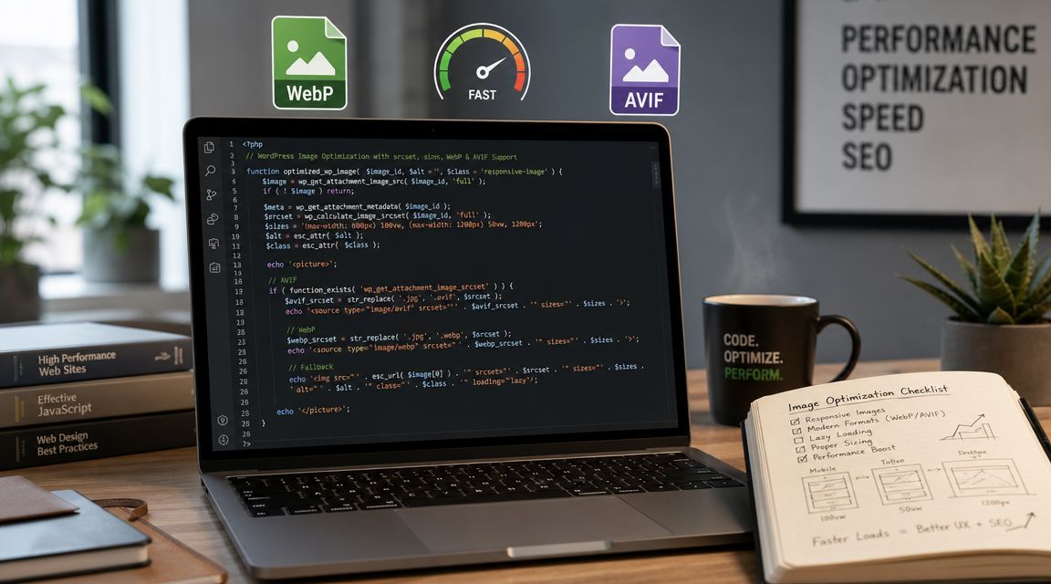
- Generate next-gen formats such as WebP or AVIF when your stack supports them.
- Preserve fallback behavior so browsers and integrations that need traditional formats still work.
- Strip unnecessary metadata if your workflow doesn’t require it.
- Apply naming and alt-text checks in editorial QA, not after launch.
If your media library is populated through imports, APIs, or custom fields, handle attachment metadata programmatically. Don’t assume editors will open each asset in the Media Library and fill in alt text manually.
Retina and high-density displays without punishing everyone else
Teams often hear “serve 2x images” and overcorrect. The goal isn’t to send oversized assets to all users. The goal is to make higher-density candidates available when the browser has a real reason to choose them.
That usually means:
- Registering appropriate intermediate sizes
- Preserving aspect ratio consistency
- Making sure
srcsetincludes enough width candidates - Avoiding a layout system that forces every card image into a single huge default
If you’re using a CDN with transformation parameters, keep the URL logic predictable. If you’re using a plugin-based workflow, test whether generated variants map correctly to the theme’s expected sizes.
A useful helper for large editorial libraries is an alt tag generator. It won’t replace human judgment for important images, but it can speed up cleanup on imported or legacy media where the alternative is leaving fields blank.
Treat image automation like application code
For teams running multiple environments, image rules need change control. Compression settings, generated formats, URL rewrites, and theme output can all alter production behavior. That’s why these changes belong in documented deployment processes, not in one-off admin-panel experiments.
Use a workflow that tracks:
- Which image sizes are registered
- Which plugin or service owns format conversion
- How URLs are rewritten
- How to revert if output breaks
- Which content types use special handling
In this context, WordPress version control practices become relevant. The code that renders image markup, the config that controls sizes, and the deployment path that can roll changes back should live together.
Automation should reduce editorial decisions, not hide engineering decisions.
That distinction matters. The more automated your pipeline gets, the more important it is that developers can explain exactly where a given image variant came from.
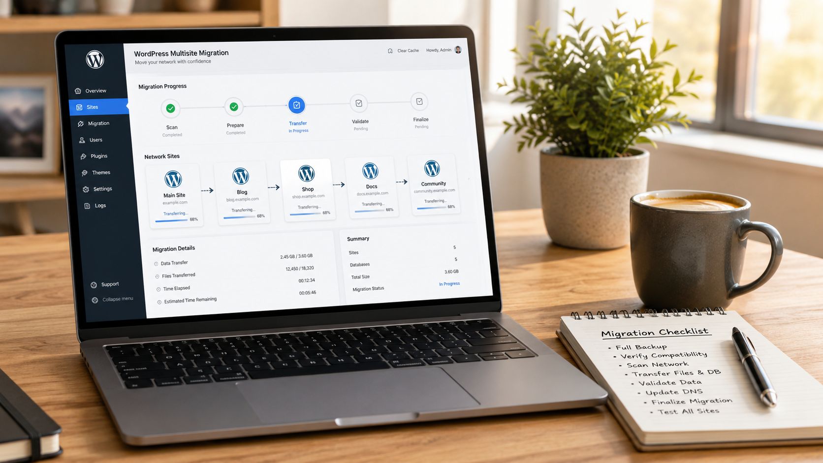
Auditing Migration and Governance
Most image projects fail in operations, not theory. Teams know they should use responsive images and modern formats. What they don’t separate clearly enough is format choice from delivery architecture, so they change both at once and then can’t tell which decision helped or broke performance-sensitive pages (WordPress learning guidance on image optimization).
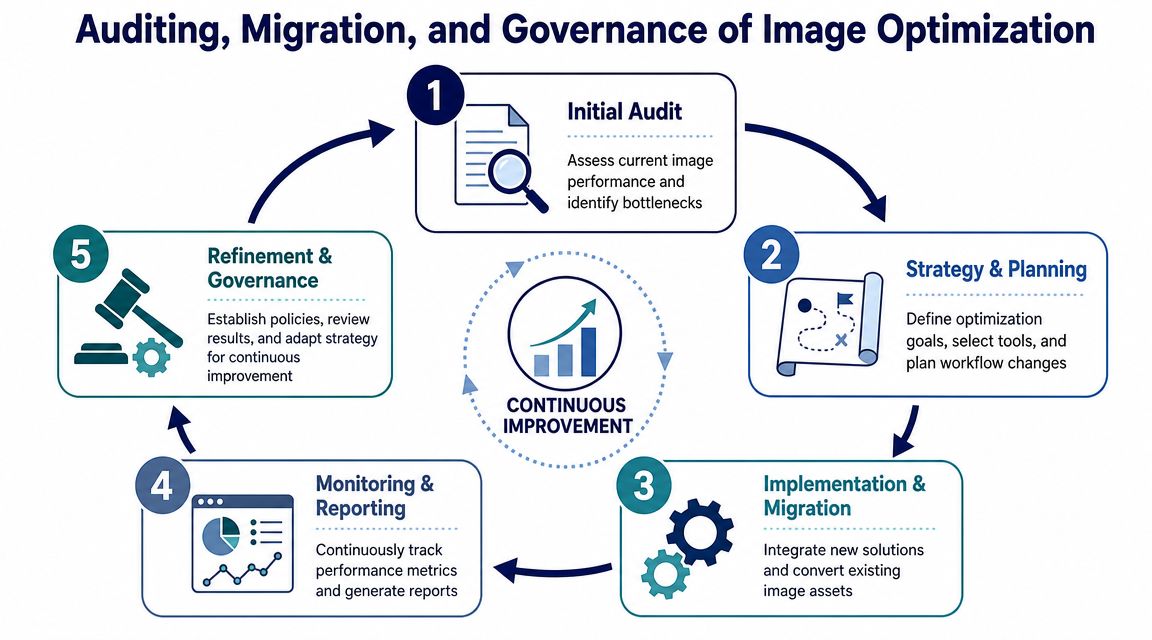
Audit first
Run Lighthouse and WebPageTest on templates that matter, not just the homepage. Check article pages, archive grids, WooCommerce product pages, and landing pages with custom blocks.
Look for three classes of problems:
- Bad source assets such as oversized originals or wrong crops
- Bad delivery such as incorrect variant selection or missing caching
- Bad rendering such as missing dimensions and layout shift
Migrate in batches and keep rollback simple
When changing plugin, format strategy, or CDN provider, don’t flip the entire library at once. Process media in batches, verify output on representative templates, and keep original files accessible until the new path is stable.
Write down the rollback path before deployment:
| Failure mode | Rollback response |
|---|---|
| Plugin update breaks image URLs | Disable rewrite layer and fall back to original attachment URLs |
| CDN transformation fails | Switch templates to stored WordPress image sources |
| Regenerated sizes mismatch design | Restore previous size registry and re-run affected media only |
Governance is what makes WordPress image optimization durable. Somebody has to own upload standards, markup output, monitoring, and incident response.
If you need a team to audit an existing media pipeline, clean up responsive image markup, or implement a scalable optimization strategy across custom themes, WooCommerce, multilingual sites, or multisite, IMADO handles that as part of its WordPress engineering and speed optimization work.