 Ask Chatgpt to summarize UI Design Services: A Complete 2026 Buyer’s Guide
 Ask Grok to summarize UI Design Services: A Complete 2026 Buyer’s Guide
 Ask Claude to summarize UI Design Services: A Complete 2026 Buyer’s Guide
 Ask Perplexity to summarize UI Design Services: A Complete 2026 Buyer’s Guide
 Ask Gemini to summarize UI Design Services: A Complete 2026 Buyer’s Guide

Visitors form an opinion about a website or product interface in milliseconds. Google’s research on visual complexity and prototypicality helps explain why early interface cues matter so much. Before users compare features, they judge clarity, trust, and effort.
That first impression has direct delivery implications for product and engineering teams. A confusing UI increases drop-off, but it also creates rework: more edge cases in development, more one-off content handling in the CMS, and more support volume after launch. I’ve seen the same pattern repeatedly in WordPress and headless builds. Teams approve attractive screens, then discover the design system does not map cleanly to components, editorial workflows, or performance budgets.
Table of Contents
Good UI design services reduce that gap between mockups and production. The work is not limited to colors, spacing, and buttons. It defines how an interface will behave across templates, devices, and states, and whether those decisions can be implemented efficiently in your stack. For companies planning enterprise WordPress solutions, that distinction matters early, because design choices affect block architecture, component reuse, QA scope, and long-term maintenance cost.
Why UI Design Services Are a Boardroom Conversation
For leadership teams, UI gets attention when it starts affecting revenue, delivery cost, and risk at the same time. A clearer interface can improve conversion, reduce support demand, and shorten sales friction, but the bigger point is operational. Interface decisions shape how efficiently a product gets built and how reliably it performs after launch.
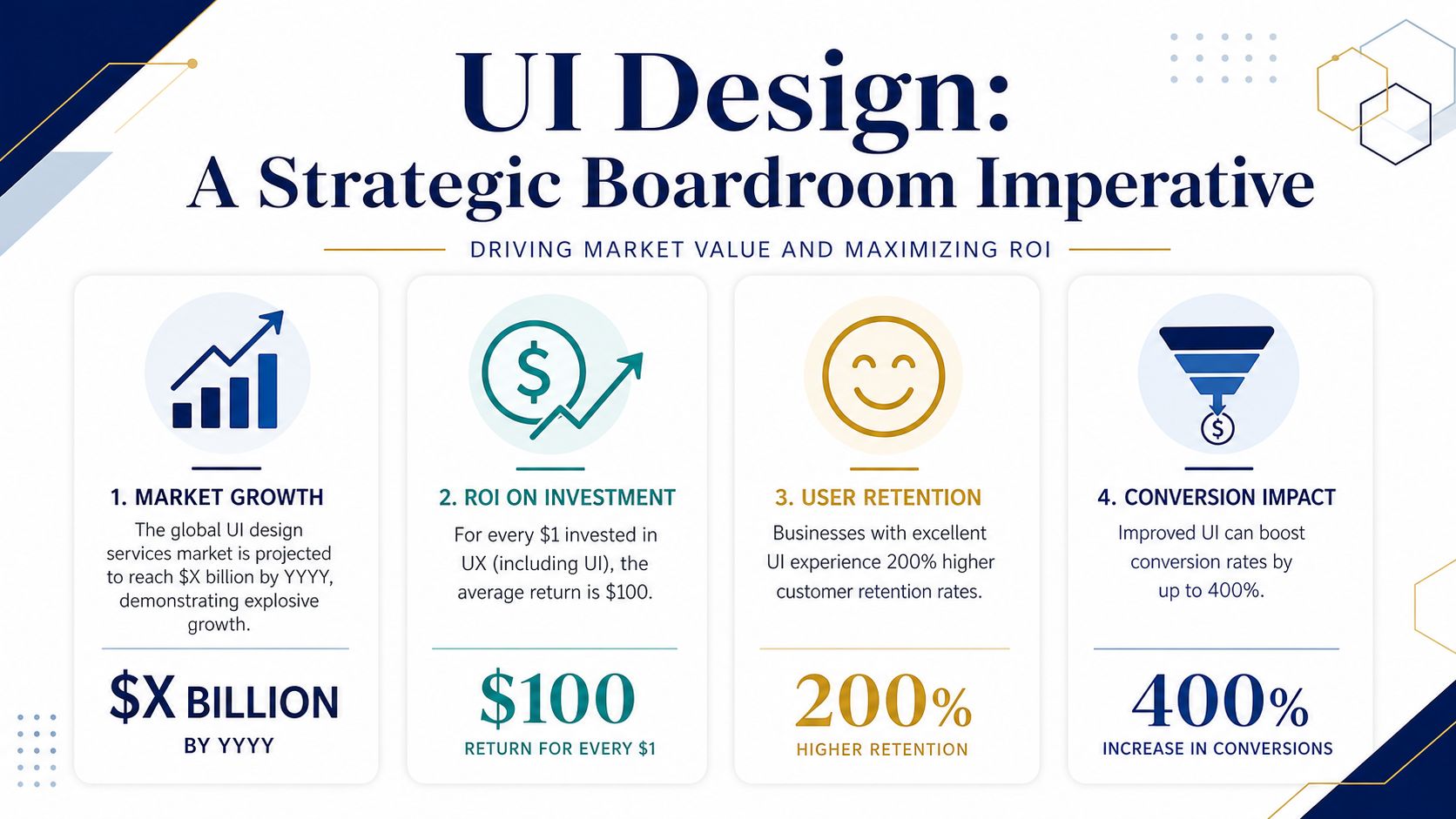
Boards are not reviewing button styles. They are reviewing whether the customer-facing layer supports the business model.
That matters because UI sits at the point where brand promise meets engineering reality. A company can invest heavily in positioning, pricing, and acquisition, then lose momentum on the screen where a prospect tries to request a demo, compare plans, or complete a purchase. In WordPress and headless builds, I see the same failure pattern often. Teams approve polished concepts, then run into component gaps, inconsistent CMS rules, and front-end behavior that costs more to implement than expected.
What leadership is really buying
Companies usually bring in UI design services to address one or more of these business problems:
- Growth friction: Traffic is reaching the product or site, but the interface does not guide users toward the next action clearly enough.
- Operational drag: Patterns are not defined well, so developers recreate common elements across templates and features.
- Brand inconsistency: Marketing, product, and content teams are presenting different signals through the interface.
- Platform mismatch: The desired experience does not fit the constraints of the CMS, design system, or front-end architecture.
In practical terms, this is why UI becomes a boardroom topic instead of a marketing line item. If a design system maps cleanly to reusable components, development gets faster, QA gets narrower, and future releases carry less risk. If it does not, the business pays twice. Once during build, and again during maintenance.
For teams planning enterprise WordPress solutions, the UI discussion usually expands quickly into governance, editor controls, performance budgets, and long-term ownership. The same applies in headless setups, where design choices affect API payloads, component libraries, preview workflows, and content modeling. Good UI work sets rules the engineering team can use.
A useful baseline appears in UXMagic’s beginner UI guide, but at the executive level the question is narrower. Can the interface support growth without creating delivery chaos?
That is why strong UI design services matter to leadership. They reduce ambiguity before build starts, tie visual decisions to technical constraints, and make project outcomes more predictable.
Deconstructing UI Design Services Beyond the Buzzwords
Most clients hear “UI design” and think screens, colors, and buttons. That’s part of it, but its core function is narrower and more useful. UI design services define the visual and interactive rules that make a product understandable at a glance and usable under real conditions.
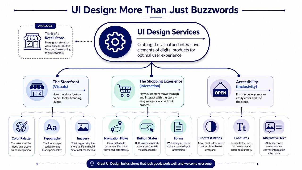
A simple analogy helps. Think of a retail store. UX is the full shopping journey, where the entrance sits, how aisles flow, how quickly someone finds the checkout, and whether the trip feels frustrating or natural. UI is the visible and interactive layer inside that journey, the signage, shelf labels, lighting, spacing, payment terminal, and every cue that tells a shopper what to do next.
What UI design services actually include
Good UI work usually covers three layers at once:
- Visual language: Color, typography, spacing, hierarchy, iconography, imagery, and component styling.
- Interaction behavior: Hover states, form feedback, menus, validation messages, filters, tabs, and responsive behavior.
- Inclusive access: Contrast, text scaling, keyboard paths, plain-language labels, and resilient patterns for imperfect conditions.
That last layer gets overlooked. Many agencies still present UI as visual identity applied to screens. In practice, the interface also has to survive poor connectivity, older devices, and content entered by non-designers.
Where buyers get confused
The confusion usually starts when vendors bundle UI, UX, branding, front-end, and product strategy into one phrase. That makes buying harder, not easier. Clients need to know whether they’re paying for exploration, interface systems, prototyping, design QA, or implementation-ready outputs.
For a concise baseline explanation, UXMagic’s beginner UI guide is a useful primer. Once you move past that entry-level view, the buying question becomes more practical: who is defining reusable components, who is accounting for CMS constraints, and who is making sure the interface can be maintained after launch.
A UI that looks refined in static mockups can still fail if editors can’t use it and developers can’t scale it.
That’s also why design tooling matters. Teams comparing Figma and Sketch for WordPress projects aren’t just debating preference. They’re deciding how handoff, component libraries, feedback, and implementation discipline will work day to day.
The Anatomy of a UI Design Project Key Deliverables
Teams usually feel the cost of missing design detail in development, not in review meetings. A screen can look approved and still leave engineering guessing about states, content limits, or CMS behavior. That guesswork is where timelines stretch and budgets start to drift.
Early deliverables that de-risk the build
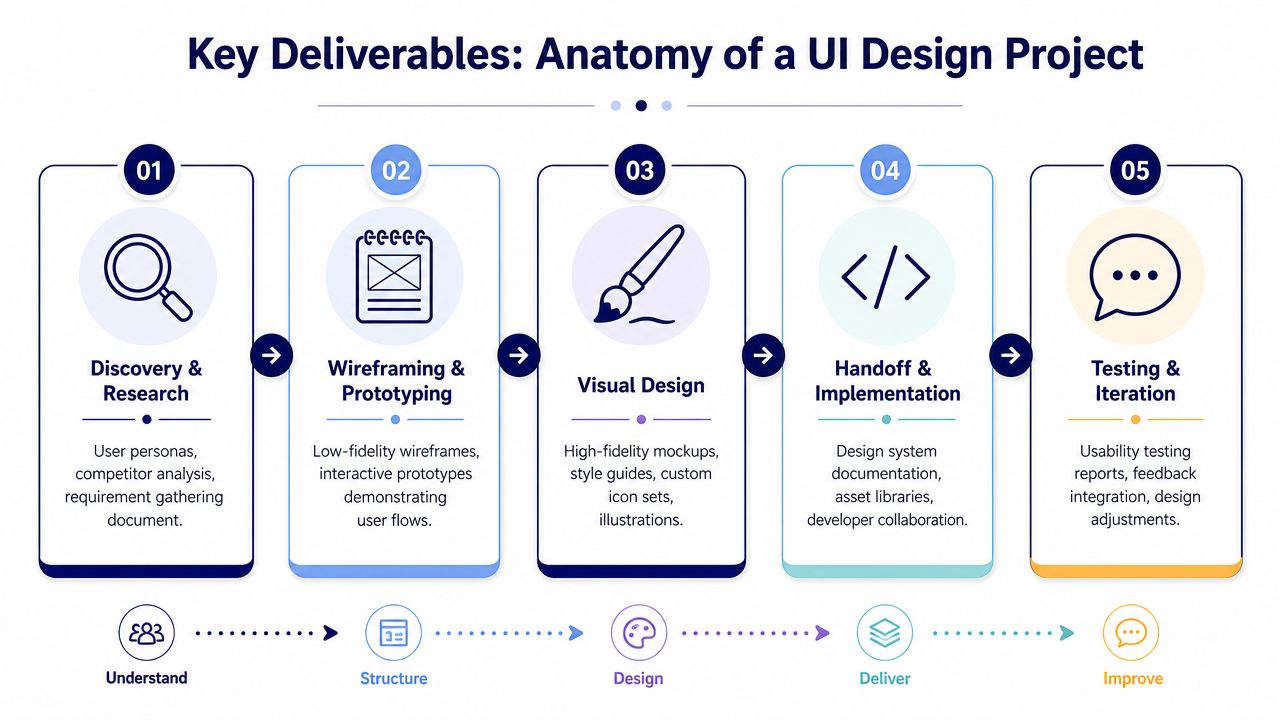
A well-run UI project starts by defining what the product has to do before the team decides how it should look. That usually means a research summary, requirement mapping, and user flows. These artifacts surface gaps early, especially when multiple stakeholders assume different rules for the same feature.
Wireframes come next. They work as structural plans for layout, hierarchy, and task flow. This is also the point where teams can resolve practical questions that affect development cost, such as whether a page needs one reusable template or several content-specific variants.
Interactive prototypes and high-fidelity mockups follow. Here, behavior, visual hierarchy, and responsive intent become concrete enough for stakeholder review and technical estimation. In WordPress and headless builds, this stage should also show what is a reusable component, what is a CMS-driven pattern, and what is a one-off treatment that will cost more to maintain.
Here is the set of deliverables clients should expect in a serious UI engagement:
| Deliverable | Why it matters |
|---|---|
| User flows | Expose missing paths, approval steps, and edge cases before screens multiply |
| Wireframes | Set structure and content priority before visual refinement starts |
| Interactive prototype | Lets stakeholders test task logic and reduces subjective feedback |
| High-fidelity mockups | Define hierarchy, visual rules, and responsive behavior clearly |
| Design system | Gives developers reusable components and standards instead of isolated files |
| Handoff documentation | Turns design intent into build rules the team can implement consistently |
Teams planning a redesign often compare deliverables against budget too early. A better starting point is whether the package gives engineering enough information to build without interpretation. That is usually what determines whether a quote is realistic. For teams budgeting a CMS-driven project, this breakdown of WordPress web design pricing factors is a useful reference point.
A short walkthrough on process can help clients visualize how this moves from concept to shipped product:
Deliverables many agencies skip
The gaps that cause problems rarely show up on homepage mockups. They show up in empty states, validation errors, loading conditions, search with no results, and long-form content entered by editors six months after launch.
A usable UI package should define responsive states, component variants, error handling, and content rules. For WordPress projects, that also means block behavior, editor guardrails, and clear rules for what happens when authors add more text, swap image ratios, or reorder modules. For headless builds, the same discipline applies at the schema and component level. Design has to map cleanly to structured content, or front-end flexibility becomes editorial confusion.
Accessibility belongs in the core deliverables, not in a post-approval audit. 71% of users with disabilities leave inaccessible sites (UX Magazine’s piece on designing for underserved communities). The same article argues for testing on low-end devices, accounting for low-bandwidth conditions, and designing with underserved communities instead of treating accessibility as a separate checklist.
What the handoff should leave with engineering
Approved screens are only part of the handoff. Developers need implementation rules.
They should leave design review with:
- Component definitions: States, spacing rules, typography tokens, and usage notes
- Behavior notes: Hover, focus, error, loading, success, and disabled logic
- Responsive rules: What stacks, wraps, truncates, hides, or changes order
- Content constraints: Character limits, image ratios, fallback behaviors, and editorial exceptions
- CMS guidance: What editors can control safely and what should stay fixed in code
When these details are documented, engineering can estimate with confidence and build faster. When they are missing, the team fills the gaps during development. That usually means extra QA cycles, inconsistent components, and revisions that should have been resolved in design.
Understanding Process Timelines and Pricing Models
Design timelines slip for a predictable reason. Approval happens before the team agrees on who decides what, how feedback is consolidated, and which assumptions are still open. Once that happens, the quote looks fixed on paper while the actual scope is still moving.
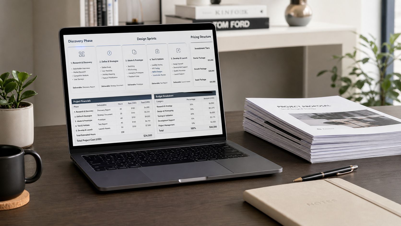
The right pricing model depends on how stable the product definition is, not on what feels easiest to purchase.
| Model | Works best when | Trade-off |
|---|---|---|
| Fixed price | Scope is stable and deliverables are clearly defined | Change requests can create friction |
| Time and materials | Product direction may evolve during discovery or testing | Requires closer budget monitoring |
| Retainer | The team needs continuous design support across releases | Less ideal for one-off, tightly bounded projects |
A brochure-style marketing site with approved templates can usually fit fixed pricing. A SaaS product with unresolved workflows, role-based permissions, or active user testing usually fits time and materials. A company shipping monthly improvements across product, content, and growth work often gets better continuity from a retainer.
Page count is rarely the main driver.
Quotes go up when the interface has more states, more exceptions, and more implementation constraints. Multi-step forms, permissions, localization, content governance, and responsive behavior all add design and review time. In WordPress and headless projects, that complexity grows again because the design has to survive real component logic, content modeling, and editor behavior after launch.
That point matters even more for teams building AI sites with headless CMS. Those projects often combine dynamic content, multiple front ends, and frequent iteration. A flat page-based estimate misses the true work because the cost sits in reusable patterns, fallback states, API-fed modules, and the rules developers need to implement them consistently.
Cheap proposals usually leave out the hard parts. Error handling, empty states, permissions, content overflow, and mobile variants do not disappear because they were skipped in the estimate. They reappear in development, where changes cost more and timelines get harder to control.
Prioritization helps keep the first release realistic. One useful method comes from this explanation of competitive UX benchmarking and Value Density Score: Value Density Score = (User Value + Business Value) / Implementation Effort. A score greater than 2.0 in that framework marks a high-priority item. I would not use the formula mechanically, but it is a practical way to compare a high-polish idea against a lower-cost improvement with clearer business impact.
Timeline planning works better with approval gates than with a single linear schedule. In practice, projects move in bursts. Stakeholders review, engineering raises constraints, content changes, then design adjusts. Good plans account for that instead of pretending every week will pass without revisions.
A workable sequence usually looks like this:
- Discovery: Gather requirements, constraints, stakeholders, and success criteria.
- Structure: Agree on flows, templates, and key interaction models.
- Visual system: Finalize components, tokens, responsive rules, and accessibility direction.
- Handoff and support: Review implementation details, answer developer questions, and inspect staged builds.
For budgeting, each phase should have a clear exit condition. Discovery ends when the team agrees on constraints and priorities. Structure ends when key flows are approved. Visual design ends when component behavior and responsive decisions are resolved enough for engineering to estimate build effort with confidence.
If you are pricing WordPress design and development together, this breakdown of WordPress web design pricing is a useful reference because it ties budget to delivery choices, CMS complexity, and implementation scope instead of treating design as a standalone artifact.
Integrating UI Design with WordPress and Headless CMS
A strong interface can still break down during implementation if it ignores the publishing system behind it. That’s where many UI projects lose quality. The mockups make sense, but the CMS model, component architecture, or editor experience doesn’t.
Classic themes, block themes, and headless builds
In a classic WordPress theme, UI implementation often relies on templates, custom fields, and theme-level logic. This can work well for controlled sites, but editors may depend heavily on developers when layouts need to change.
In a Gutenberg or Full Site Editing build, the UI has to become a set of blocks and patterns with clear rules. That changes the design brief. You’re no longer designing pages alone. You’re designing what editors can assemble safely without breaking hierarchy, spacing, or content flow.
In a headless setup, the challenge expands again. The same design language may need to support a website, app views, campaign landing pages, and API-driven content modules. A loose visual style guide isn’t enough. You need a real design system with tokens, reusable components, state definitions, and content model awareness.
What engineering needs from the design team
UI design services either help development or create debt.
For WordPress and headless work, the design team should define:
- Component boundaries: What is a reusable block, card, banner, or form pattern.
- State logic: Loading, error, empty, success, disabled, and permission-based variants.
- Editor constraints: Which fields are optional, how long text can run, and which media ratios are safe.
- Performance-aware choices: Animation restraint, image behavior, and patterns that won’t punish rendering.
For teams exploring modern architectures, MeshBase’s overview of building AI sites with headless CMS is a useful companion because it frames content modeling and front-end flexibility in practical terms.
The overlooked layer is editor experience
A design can be visually excellent and still fail the people who run the site every day. Marketing teams need modules they can reuse. Content editors need guardrails that prevent layout drift. Developers need consistency so they can build once and reuse confidently.
That’s one reason teams compare platforms before they finalize the design system. A project weighing WordPress and Strapi isn’t only choosing a CMS. It’s choosing how components, workflows, governance, and front-end responsibilities will be shared.
If the design ignores the editor, the product team inherits the problem after launch.
The best UI work translates design intent into buildable, governable patterns. That’s what keeps a polished launch from turning into a messy second quarter.
Choosing Your UI Design Partner A Vendor Checklist
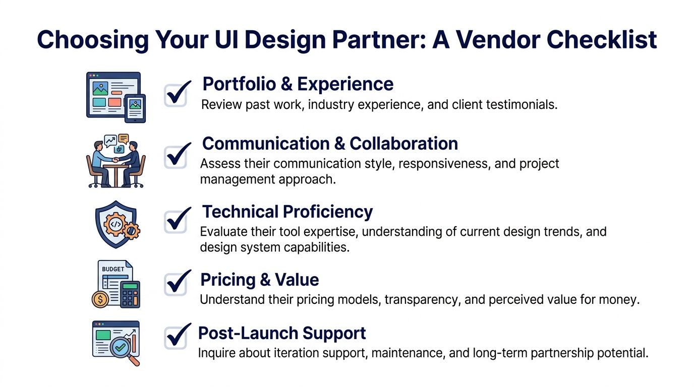
Vendor selection matters because design quality compounds. So does design debt. According to UI Things’ roundup of UI design statistics, investment in professional UI/UX design can yield a 9,900% ROI, or $100 for every $1 invested. That makes the partner decision less like buying a creative service and more like hiring a strategic operator.
Questions worth asking in the first call
A portfolio matters, but the conversation matters more. Ask questions that reveal how the agency thinks under constraints.
- How do you connect design work to business outcomes? You want answers about conversion paths, task completion, support friction, or platform governance, not only style.
- How do you handle WordPress or headless implementation? Strong partners can discuss blocks, templates, components, APIs, and handoff detail without hand-waving.
- What do your deliverables include beyond mockups? Listen for design systems, responsive behavior, edge cases, accessibility, and QA support.
- How do you manage feedback and approvals? Unclear approval loops are one of the fastest ways to lose time and budget.
- How do you treat content reality? A serious team designs for real copy, translation expansion, and editor misuse.
Green flags and red flags
Here’s the pattern I trust after years of handoff reviews.
Green flags
- The team asks about product goals before visual preferences.
- They want to see your CMS, analytics context, and current design debt.
- They talk about states, accessibility, and implementation early.
- They can explain what should be standardized and what should stay custom.
Red flags
- They promise final visuals immediately.
- They only show hero sections and glossy landing pages.
- They avoid discussing engineering constraints.
- They treat accessibility as a late compliance task instead of a design requirement.
A smaller but important due diligence item is licensing. Fonts, icons, stock assets, and usage rights often create friction between agencies and clients after launch. Font Checker Pro’s font licensing insights are worth reviewing before contracts are signed, especially if your brand system spans multiple products or regions.
What a strong partner sounds like
“We need to understand your stack, your content workflow, and what success looks like before we talk about screens.”
That answer is usually more valuable than a dramatic concept deck. The right partner doesn’t just produce an attractive interface. They reduce ambiguity for product, content, and engineering teams at the same time.
Measuring Success Onboarding and ROI
The actual test starts after approval. If the handoff is weak, developers guess. If developers guess, the shipped product drifts from the intended experience. Clean onboarding means shared component libraries, implementation notes, review checkpoints, and a process for resolving edge cases before they reach production.
Success also needs metrics that move the conversation beyond taste. Maze’s guide to UX benchmarking points to time on task and error rate as core measures, and for interactive applications it highlights INP and TBT as critical technical indicators tied to the fluidity of the experience.
What to measure after launch
- Time on task: How quickly users complete a core action.
- Error rate: Where they hesitate, misclick, or fail.
- INP and TBT: Whether the interface feels responsive under real interaction.
- Task-specific outcomes: Checkout completion, form progression, dashboard usage, or content discovery.
These metrics matter because they connect UI decisions to business performance without reducing the conversation to opinion. If a redesigned form looks cleaner but users take longer to finish it, the design hasn’t improved the product.
A strong post-launch rhythm is simple. Review live builds against the design system, collect friction points from support and analytics, prioritize fixes, and keep the interface honest as content and features expand. UI design services create the foundation. Ongoing measurement proves whether that foundation is doing its job.
If your team needs UI design that holds up in real WordPress or headless delivery, IMADO can support the engineering side of that equation with custom themes, Gutenberg and FSE builds, headless implementations, accessibility-focused development, and structured handoff processes that keep design intent intact in production.
Let’s build something exceptional
Tell us about your project – we’ll help you launch a fast, scalable, SEO-optimized WordPress platform built for growth.