


The most repeated advice about the fold is also the least useful: “put everything important above it.” That rule creates cramped hero sections, weak storytelling, and pages that try to close the sale before they’ve earned attention.
A better view is simpler. The first screen has to do one job well: make the next action obvious. Sometimes that action is a click. Often, it’s a scroll. If your page can’t create that momentum, the lower sections won’t matter. If it can, below-the-fold content becomes where trust, detail, and conversion logic is built.
For marketing teams working in WordPress, that distinction matters because layout decisions are never abstract. They affect template design, block patterns, media loading, Core Web Vitals, and how you interpret analytics. The below the fold meaning isn’t just “stuff farther down the page.” It’s a practical way to think about attention, sequencing, and engineering trade-offs.
Table of Contents
What Below the Fold Actually Means Today
Below the fold means the part of a page that isn’t visible when the page first loads and requires scrolling to see. In web analytics and UX, that boundary depends on the viewport, so it changes by device, screen resolution, and browser chrome. There is no universal fold line, as noted by Digital Shift’s definition of below the fold.
That’s why the old “above the fold is everything” mantra breaks down in practice. It treats the first screen like the whole page instead of the opening scene.
A more accurate way to explain the below the fold meaning to a marketing team is this: above the fold attracts attention, below the fold earns conviction. The first visible area works like a storefront window. It should quickly tell people where they are, what you offer, and what to do next. The content farther down works like the inside of the store. That’s where buyers compare, evaluate, and decide whether your promise holds up.
What the fold is actually doing
The fold isn’t dead, but it’s often misunderstood. It’s not a line that separates important content from unimportant content. It’s a transition point in the user journey.
Below the fold usually carries material like:
- Supporting proof such as testimonials, trust signals, feature detail, or FAQ content
- Decision support including use cases, objections, pricing context, and implementation information
- Secondary conversion paths like alternate CTAs for visitors who weren’t ready to act immediately
When teams ignore that sequencing, they often create pages that feel front-loaded and oddly shallow. The first screen shouts. The rest of the page rambles.
Practical rule: Don’t ask the hero section to close a conversion that the page hasn’t justified yet.
Why this still matters in day-to-day design
In real builds, the fold is where messaging strategy meets layout strategy. A homepage, campaign landing page, product page, and long-form sales page each need a different balance of immediate clarity and delayed detail.
This is also why scroll behavior matters more than fixed placement. If you’re reviewing eye-tracking on websites, the useful takeaway isn’t “everyone looks at the same spot.” It’s that attention follows hierarchy, contrast, and relevance. Good pages don’t merely expose content. They guide attention into the next section.
That’s the modern below the fold meaning. It isn’t hidden leftovers. It’s the part of the page that has to reward curiosity.
From Newspapers to Pixels The Origin of the Fold
The phrase below the fold didn’t start on websites. It came from newspapers. Editors placed the most important headlines above the physical fold because that was the part people could see when a paper sat folded on a newsstand. Lower-priority items went underneath. Dynamic Yield’s glossary entry on below the fold traces that shift from print to digital, where the fold became a screen boundary instead of a paper crease.

That history matters because the term carries a built-in hierarchy. It was never just a descriptive label. It reflected a publishing decision about visibility and priority. The newsroom asked, “What must be seen first?” Web teams still ask the same question.
Why the term survived the move online
When websites adopted scroll-based layouts, the metaphor held. Users saw one screen first. Everything else required an action. The mechanics changed, but the editorial logic stayed the same.
That’s why the fold still shows up in conversations about landing pages, campaign pages, and one-page sites. On a one-page website development project, this becomes very obvious. The entire page depends on sequencing. The top introduces the offer. The lower sections build the case. If the top says too little, people leave. If it says too much, the page loses rhythm.
Good one-page design borrows more from editorial structure than from decorative layout.
The newspaper origin is old, but the principle is current. First visibility shapes what gets attention first. The screen changed. Human scanning behavior didn’t become irrelevant.
Why the Fold Still Matters for UX SEO and Conversions
The fold still matters because visibility affects behavior. Salsify states that below-the-fold content “tends to not get as much interaction or engagement as above-the-fold content,” which is why teams treat the first screen as prime real estate in page planning, as described in Salsify’s explanation of below-the-fold engagement.
That doesn’t mean lower content is unimportant. It means it has a different job and faces a higher bar. Users must choose to reach it.
UX depends on information scent
The strongest pages make the first screen answer three questions quickly:
| User question | What the page should show early |
|---|---|
| Am I in the right place | A clear headline and context |
| What is this offer | A concise value proposition |
| What should I do next | A visible next step or a strong cue to scroll |
If one of those is missing, the user has to work too hard. When teams overload the hero with sliders, multiple CTAs, long intro copy, and competing visuals, they usually weaken all three answers.
Below the fold then becomes harder to reach, not because users refuse to scroll, but because the first screen never gave them a reason.
The first screen should reduce uncertainty. The lower sections should resolve objections.
SEO isn’t just about keywords in the hero
SEO teams sometimes flatten this topic into “put the target keyword above the fold.” That’s too narrow. Search visibility and on-page effectiveness depend on whether the page renders key content clearly and quickly, and whether the content hierarchy supports intent.
In practical terms, the fold affects SEO in at least three ways:
- Content prioritization: The top of the page should establish topical relevance without burying the primary subject under decorative elements.
- Render priority: Heavy hero media, scripts, or block patterns can delay the visible portion of the page, which hurts perceived speed.
- Template discipline: Repeating oversized headers across templates can push meaningful page content too far down, especially on mobile.
If you’re working through SEO above the fold considerations, the useful lens is prioritization, not stuffing. The visible area should load cleanly and communicate the page purpose fast.
Conversion strategy changes by intent
A CTA above the fold isn’t automatically better. It’s better when intent is already high.
For branded search landing pages, urgent service pages, or logged-in product flows, an early CTA often makes sense because the user already knows what they want. For category pages, SaaS product pages, and high-consideration service pages, many visitors need evidence first. In those cases, a lower CTA often performs better because it appears after the page has done some persuasion work.
Here’s the trade-off marketers should use:
- Put the CTA early when the offer is simple, familiar, or urgent
- Delay the primary CTA when the buyer needs trust, proof, or explanation
- Use both when you want one immediate path and one better-informed path later
What doesn’t work is treating every page like a direct-response ad with no nuance. Some users are ready now. Others need a case. Good page structure supports both without turning the hero into a traffic jam.
The Myth of a Fixed-Pixel Fold
A lot of teams still ask the wrong question: “Where is the fold in pixels?” The old desktop answer was usually treated as a rule. It isn’t one.
Optimizely notes that many designers historically used roughly 600 px from the top as an average fold reference, but the cutoff varies with the user’s browser window and display, which makes responsive design and scroll cues more dependable than a single assumed line, according to Optimizely’s glossary entry on below the fold.
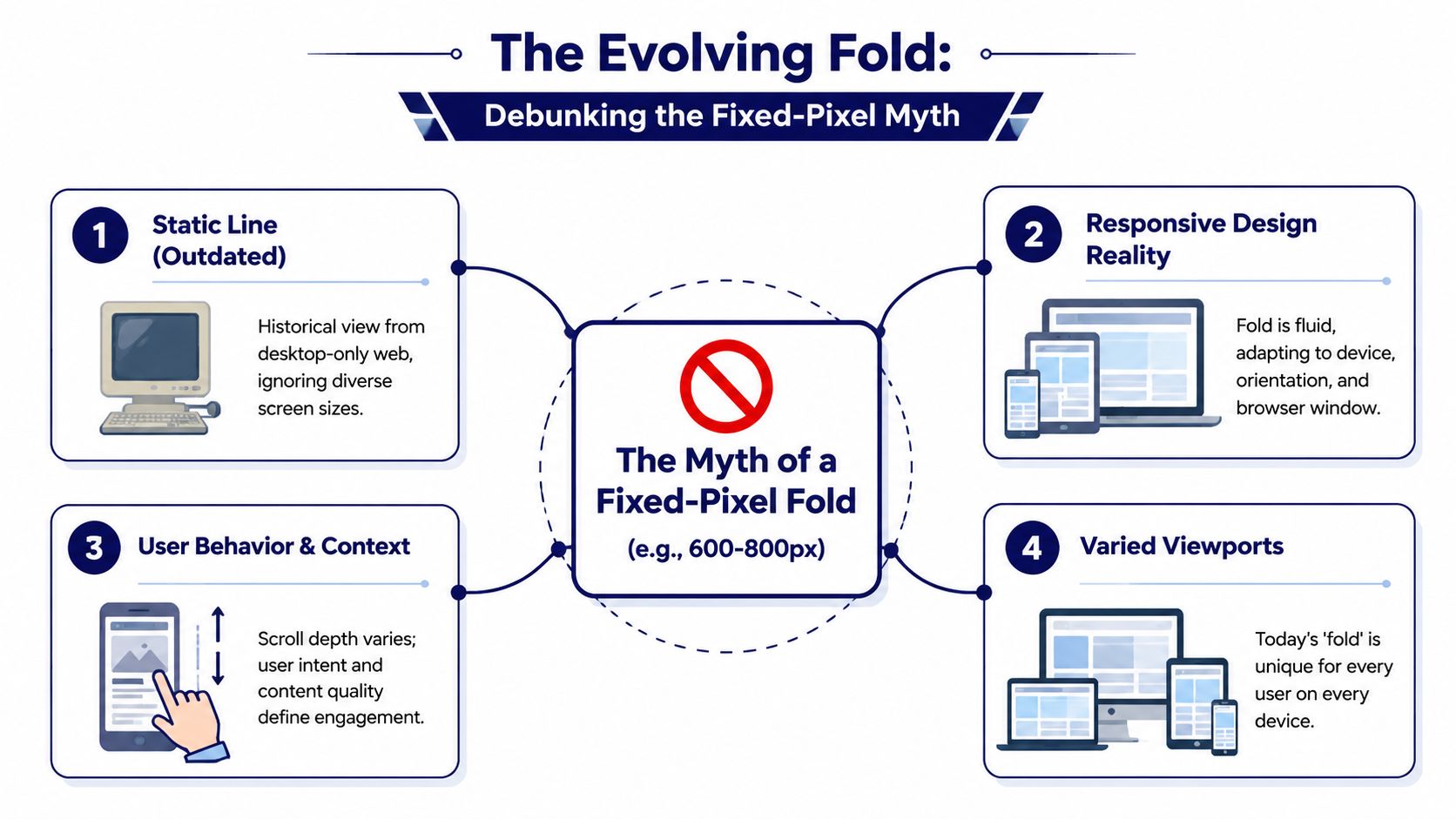
Why fixed-pixel thinking fails
A rigid fold assumption breaks as soon as you test across real environments. A large desktop display, a laptop with browser chrome visible, and a mobile screen in portrait mode will all expose different amounts of content on load.
That’s why I advise teams to think in terms of a fold zone, not a fold line. The zone is the range where the first-screen experience changes across common viewports.
Three things usually shift that zone:
- Device class: Mobile reveals much less vertical content than desktop.
- Browser context: Toolbars, admin bars, cookie banners, and announcement strips reduce visible space.
- Template behavior: Different headers, hero heights, and block spacing can move key content in or out of view.
A better way to plan
You don’t need a mythical universal number. You need a repeatable review method.
Use this approach:
- Identify your major templates such as homepage, landing page, product page, article, and archive.
- Review them at common breakpoints rather than one idealized screen.
- Check what appears before scroll for each key audience context.
- Adjust hierarchy, not just spacing, when something important drops too low.
For WordPress sites, this becomes especially important because editors can add blocks, banners, featured images, and embeds that change first-screen composition without realizing it. That’s why responsive QA matters more than arguing over a single pixel value.
For teams refining mobile responsive WordPress design practices, the fold should be treated as a moving UX constraint. Design systems handle that better than one-off page tweaks.
How to Measure and Optimize for the Fold in WordPress
The practical answer to below the fold meaning in WordPress is this: define it per template, per device segment, and per content type. That aligns with Directive Consulting’s note that modern teams should define the fold by template and analytics segment rather than as a universal number.

That sounds conceptual, but the implementation is concrete. In WordPress, you can measure fold behavior, optimize what loads first, and build templates that encourage scrolling instead of fighting it.
Measure the fold by template, not by opinion
Start with analytics and behavior tools. Don’t begin with design preference.
A practical workflow looks like this:
- Segment by page template: Separate homepage, landing pages, service pages, WooCommerce product pages, blog posts, and long-form campaign pages. Each has a different reading pattern.
- Review device categories: Look at desktop, tablet, and mobile separately. Don’t average them into one blurred picture.
- Use session replay and heatmaps: Microsoft Clarity and Hotjar both help you see where users stop, hesitate, or miss important transitions.
- Track scroll depth events: In GA4 or through Tag Manager, record meaningful thresholds based on your actual page structure, not arbitrary reporting habits.
When teams skip segmentation, they get misleading answers. A page that looks healthy on desktop may lose key proof sections on mobile because the hero and sticky header consume too much vertical space.
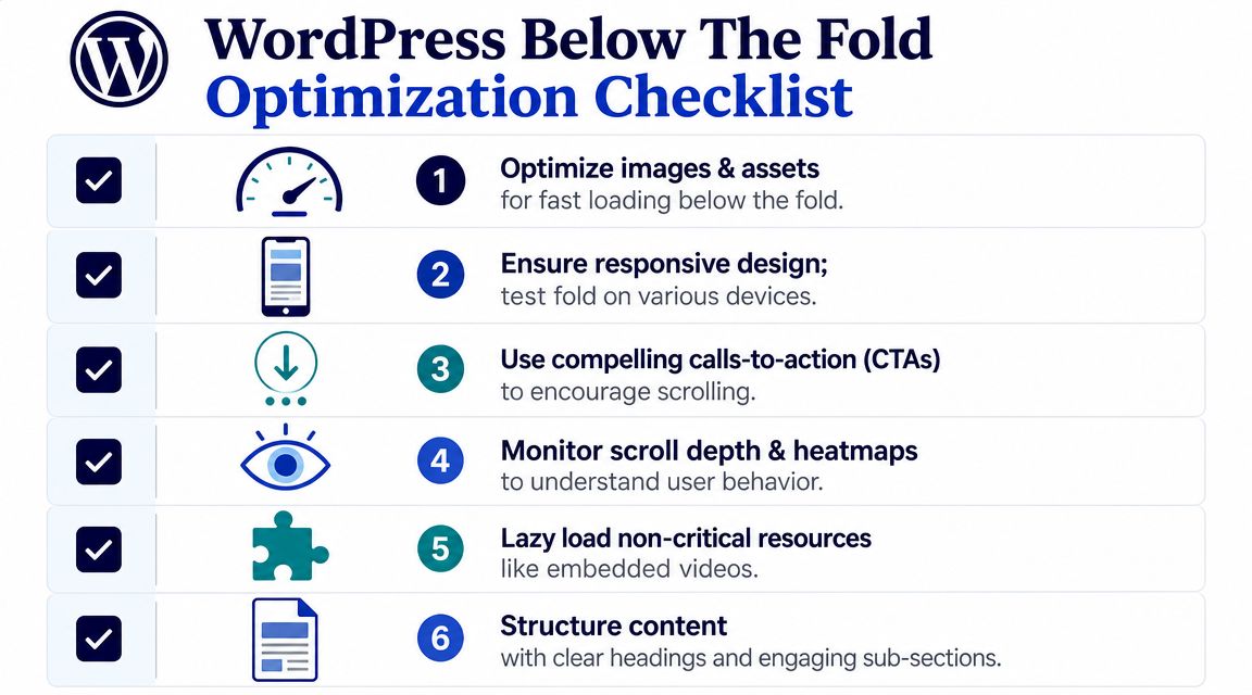
Optimize first-screen rendering in WordPress
The fold is also a performance problem. If the visible part of the page renders slowly, your messaging can’t do its job.
On WordPress builds, I usually focus on these technical levers first:
- Critical CSS: Deliver styles needed for the first visible screen early so the layout appears without waiting for the whole stylesheet bundle.
- Image discipline in hero sections: Use correctly sized assets, avoid oversized background media where a static image would do the job, and make sure the featured visual supports the message instead of delaying it.
- Deferred non-critical JavaScript: Sliders, animations, chat widgets, and third-party tags often compete with the page’s opening render.
- Lazy loading below-the-fold assets: Images, embeds, and iframes lower on the page should wait until they’re needed.
WordPress implementation matters. Gutenberg makes it easy for editors to add rich blocks, but it also makes it easy to stack heavy assets near the top of the page. Theme and block-level guardrails help a lot.
One option for teams that want engineering support around this is IMADO, which works on WordPress performance patterns such as critical CSS, custom block output, and asset-loading strategy. The important point isn’t the vendor. It’s that fold-aware optimization needs both design and engineering input.
Build Gutenberg and FSE patterns that support scrolling
The strongest WordPress pages don’t just load fast. They create momentum.
Use Gutenberg and Full Site Editing to standardize this in reusable patterns:
| Pattern element | What it should do |
|---|---|
| Hero block | Clarify offer and next step without exhausting the story |
| Transition section | Bridge the first screen to proof, use cases, or value detail |
| Proof modules | Add testimonials, logos, FAQs, or trust indicators where they support a decision |
| Secondary CTAs | Catch users after they’ve seen enough to act |
A few implementation habits help a lot:
- Avoid false bottoms: Large horizontal breaks, oversized whitespace, or full-width blocks with no visible continuation can make the page feel finished too early.
- Let content cross the fold naturally: A partially visible heading, image edge, or section transition can invite motion better than a giant arrow graphic.
- Keep sticky UI honest: Sticky headers and consent bars can consume a surprising amount of mobile viewport height. Test with them active.
- Use reusable block patterns: If every marketer builds the hero differently, fold quality will drift page by page.
This walkthrough is useful context for teams discussing page structure and lazy-loaded sections:
What usually works and what usually fails
What works
- Clear heading hierarchy
- A first screen with one primary purpose
- Supporting detail placed where it answers natural objections
- Controlled media loading
- Template-level patterns editors can reuse safely
What fails
- Treating the homepage fold and the product-page fold as the same problem
- Forcing every CTA into the hero
- Letting plugins inject banners and widgets above the main value proposition
- Measuring only clicks, without checking scroll behavior and device differences
WordPress gives teams a lot of publishing freedom. Without template discipline, that freedom usually pushes the page into inconsistency. Fold-aware design is one of the cleanest ways to get that control back.
A B Testing Your Above and Below the Fold Content
Once the page is measurable and technically stable, test layout decisions instead of debating them. The goal isn’t to prove that above-the-fold content is “better.” The goal is to learn which sequence helps your audience act.
Strong test hypotheses
Good fold tests are specific and tied to user intent. Examples:
- CTA timing: Does placing the primary CTA in the hero outperform placing it after a proof section?
- Scroll encouragement: Does a visible partial next section increase scroll depth compared with a hard visual stop?
- Value-first layout: Does a shorter hero with a faster path to proof improve engagement on mobile?
- Trust placement: Do testimonials work better immediately after the hero or lower on the page after feature detail?
Keep one rule in mind: test one structural idea at a time. If you change headline, imagery, CTA label, section order, and form length all at once, you won’t know what caused the outcome.
Test sequence, not just elements. A strong section in the wrong position often underperforms a simpler section placed at the right moment.
Watch for false bottoms
A false bottom happens when the design accidentally signals “end of page” even though more content continues below. Common causes include a full-width background break, a footer-like band, excessive spacing, or a giant form block that visually closes the story too soon.
Two useful experiments:
- Add continuation cues such as a visible next heading or cut-off image edge near the lower part of the first screen.
- Reduce abrupt section endings by tightening vertical space and smoothing the transition into the next content block.
For WordPress teams, run these tests at the template level when possible. If one landing page wins because of a cleaner transition into lower content, convert that change into a reusable block pattern rather than leaving it as a one-off fix.
Your WordPress Below the Fold Checklist
A useful fold review doesn’t ask, “Did we put enough content at the top?” It asks, “Did we place the right content in the right sequence, and does the site support that sequence technically?”
Use this checklist when auditing a WordPress site:
- Check template-specific fold behavior: Review homepage, landing pages, service pages, posts, and product templates separately.
- Review major viewport groups: Test desktop and mobile experiences with real headers, banners, and consent elements enabled.
- Audit first-screen purpose: Make sure each template has one clear goal, not five competing ones.
- Measure scroll behavior: Use GA4 events plus Clarity or Hotjar to see whether users reach key supporting sections.
- Prioritize rendering: Inline or otherwise prioritize critical CSS for visible content, and defer non-essential scripts where possible.
- Lazy load lower-page assets: Apply it to images, embeds, and iframes that don’t need to render immediately.
- Remove false bottoms: Check whether spacing, color bands, or full-width blocks make the page feel finished too early.
- Standardize block patterns: Use Gutenberg and FSE patterns so editors don’t accidentally break fold logic from page to page.
- Test CTA position by intent: Put immediate-action CTAs high when intent is high. Move them lower when the buyer needs persuasion first.
- Validate on live content: Don’t sign off on empty templates only. Real headlines, real images, and real embeds often change the fold dramatically.
The best teams treat the fold as an editorial and engineering checkpoint. That’s where the below the fold meaning becomes useful. It stops being jargon and becomes a practical way to improve page clarity, speed, and conversion flow.
If your team needs senior WordPress engineers to audit template behavior, improve first-screen performance, or build Gutenberg and FSE patterns that make above- and below-the-fold content work together, IMADO can support full builds, white-label delivery, or on-demand engineering capacity.
