

Nearly every major website still has accessibility defects. The clearest benchmark, the WebAIM Million, found that 95.8% of the top 1 million homepages had detectable WCAG failures in 2025, with 56.8 errors per page on average. In the 2026 update, the average was 56.1 errors per page across the same 1 million pages. That’s the part many teams miss. Accessibility problems aren’t rare bugs hiding on obscure pages. They’re part of how most websites are currently built.
For a marketing director or product owner, that changes the conversation. This isn’t only about compliance language, audits, or a checklist your developer runs before launch. It’s about whether core journeys work for real customers using screen readers, zoom, keyboards, touch accommodations, voice input, or larger text settings. If the nav can’t be operated, the form error isn’t announced, or the checkout breaks under zoom, the sale is gone.
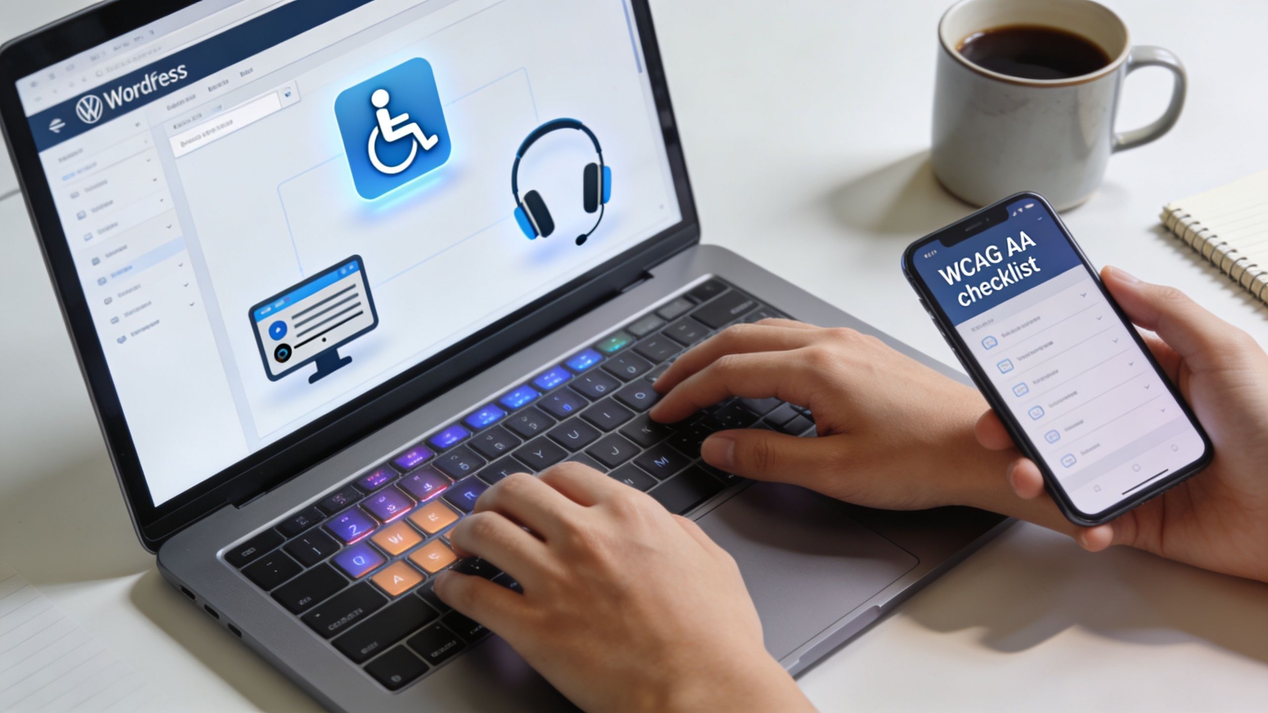
WordPress and WooCommerce teams run into this constantly because they work in systems with lots of moving parts. Themes, plugins, custom Gutenberg blocks, popups, cookie banners, product variations, payment gateways, and third-party widgets all affect accessibility. General WCAG advice is useful, but it often stops before the point where a team needs practical direction on what to fix inside the CMS they use.
Table of Contents
The Unseen Barrier on 96 Percent of Websites
The bigger issue is not that accessibility defects exist on a few neglected sites. They appear on ordinary business sites, in ordinary user journeys, and they often sit in the templates, plugins, and content patterns teams use every day.
That matters because a customer does not experience accessibility as an audit finding. They experience it as a blocked task. A product filter cannot be used from a keyboard. A button says “Read more” with no context. A coupon error appears on screen but is never announced. On a WooCommerce site, those failures interrupt product discovery, add friction at checkout, and cut into conversion before anyone labels the loss correctly.
What this means in commercial terms
A site can look polished in a design review and still fail in live use. The problems are usually familiar. Low-contrast text, weak link labels, missing form labels, menus that do not work predictably, and modals that trap focus all show up on production WordPress sites.
They also hide in plain sight.
Internal teams usually test with a mouse, on a large screen, while already knowing where everything is. That masks the problem. Customers using screen readers, zoom, keyboard-only navigation, or voice input do not get that shortcut. One blocked interaction in a quote request, donation form, or checkout flow is enough to lose the conversion.
This is one reason teams responsible for WordPress websites for nonprofits and public-facing organizations often need accessibility addressed early. Their sites depend on forms, donations, events, and service access that have to work for a wider range of users and under closer public scrutiny.
Why WordPress teams underestimate it
WordPress lowers the barrier to publishing. It also lowers the barrier to shipping inconsistent markup. Editors can add images without useful alt text, paste styled content from other sources, upload inaccessible PDFs, and embed third-party tools that were never checked for keyboard support or screen reader behavior.
Gutenberg adds another layer of risk and opportunity. Core blocks can support accessible patterns, but custom blocks often break heading order, label relationships, focus handling, or error messaging if they are built without those requirements. WooCommerce adds high-value flows with more states to manage, such as variation selectors, mini-carts, coupon fields, payment steps, and account areas.
The practical shift is simple. Stop treating accessibility as cleanup after launch. Build accessible defaults into themes, blocks, plugin selection, content workflows, and release testing. On a WooCommerce site, start with the journeys tied directly to revenue. Search, product pages, cart, checkout, and account access tend to carry more business risk than the average content page.
Why Accessibility Is a Boardroom Issue
Accessibility belongs in leadership discussions because it affects risk, revenue, and reputation. Teams usually discover this too late, after a complaint, a failed procurement review, or a redesign that introduced barriers into critical user flows.
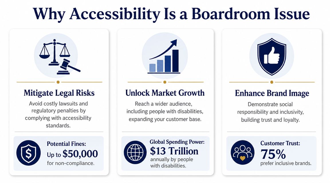
Legal exposure starts with ordinary UX failures
Many accessibility disputes begin with very ordinary problems. A menu can’t be used without a mouse. A form field has no proper label. A modal steals focus and won’t close predictably. A checkout error appears visually but isn’t announced to assistive technology.
Those aren’t edge cases. They’re routine implementation failures on production sites.
For boards and leadership teams, the practical takeaway is simple. If your digital property supports marketing, lead generation, account access, donations, bookings, or ecommerce, accessibility needs ownership and budget. Organizations with public-service or mission-driven responsibilities often face even closer scrutiny, which is one reason teams working on WordPress for nonprofits usually benefit from addressing accessibility early instead of treating it as post-launch cleanup.
Revenue is tied to operability
An inaccessible site leaks commercial value in small, repeated ways. Users leave when they can’t enlarge text cleanly, understand field requirements, select a product option by keyboard, or dismiss a sticky overlay on mobile. Marketing may keep optimizing acquisition while the experience still excludes people at the point of action.
Accessibility work often improves the same things conversion teams care about anyway:
- Clearer interfaces that reduce hesitation
- More stable forms with explicit labels and usable error handling
- Better navigation that helps people reach content faster
- More resilient mobile interactions with larger tap targets and fewer blocking overlays
Brand trust is earned in the details
Brands rarely lose trust because they lacked a statement about accessibility. They lose it when the site signals carelessness. Broken focus order, unreadable contrast, and inaccessible documents tell users the experience wasn’t designed with them in mind.
Practical rule: If your team would treat a broken checkout button as a priority defect, treat an inaccessible checkout control the same way.
Executives don’t need to memorize WCAG language. They need to understand that accessibility is now part of digital quality. The organizations that handle it well usually give product, content, design, and engineering teams a shared standard and a clear remediation path.
The Four Categories of Web Accessibility Failures
WCAG gets easier to use when teams sort issues into four buckets. The framework is organized around POUR: Perceivable, Operable, Understandable, and Resilient. For WordPress and WooCommerce teams, that model is practical because it turns broad compliance language into fixable defects inside themes, blocks, plugins, templates, and checkout flows.
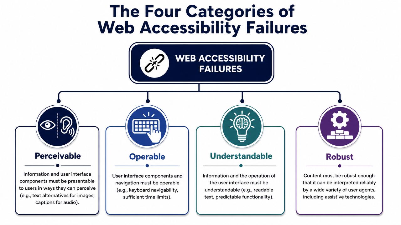
Perceivable means users can detect the content
If people cannot see, hear, or distinguish the content, they cannot use the page. Common failures include weak color contrast, missing alt text, poor heading structure, captions that are missing or inaccurate, and text baked into images.
Low contrast is still one of the most common problems on marketing sites. AudioEye’s accessibility statistics summary notes that WebAIM reported widespread homepage failures tied to low-contrast text. In WordPress, this usually shows up after a brand refresh. Buttons inherit campaign colors, announcement bars use small pale text, and Gutenberg blocks get published before anyone checks contrast against WCAG.
The business impact is direct. Users miss offers, cannot read product details, and abandon pages that looked polished in review but fail under real conditions such as glare, mobile use, or low vision settings.
Operable means users can use the interface
Operable failures block action. Users may be unable to tab through navigation, see where keyboard focus is, close a modal, activate a control on mobile, or complete a task at 200 percent zoom.
This is a recurring problem on WooCommerce builds because conversion features often introduce friction. Sticky add-to-cart bars, slide-out carts, popups, chat widgets, cookie banners, and variation selectors can overlap each other or trap focus. A product page may look fine in a desktop review and still become difficult to use on a phone or with a keyboard.
A control that exists in the code but cannot be reached or activated is still a broken control.
Understandable means people know what the interface is doing
Users need clear labels, predictable behavior, and useful feedback. Failures in this category include vague link text, form fields without visible labels, unexplained validation errors, unexpected context changes, and instructions that rely on color or position alone.
WooCommerce checkout is a common trouble spot. Teams replace labels with placeholder text, hide required-field guidance, or customize checkout steps without explaining what changed. Shipping updates, tax recalculations, and coupon interactions may happen dynamically, but the user gets little feedback. That creates hesitation at the point where revenue is supposed to convert.
Content choices matter here too. Marketing teams often publish brochures, menus, spec sheets, and campaign PDFs that bypass accessible HTML patterns. For teams deciding whether to keep using PDFs or shift content into the site, this guide to understanding accessible documents is a useful reference.
The “R” in POUR stands for Robust, which means the code works with assistive technology
This category is about compatibility. Screen readers, speech input tools, browser extensions, and other assistive technologies depend on semantic HTML, correct form relationships, meaningful landmarks, and component states that are exposed properly.
On WordPress sites, custom development and plugin combinations often create hidden failures. A page can look correct and still have buttons built from generic div elements, form fields without programmatic labels, accordions that never expose expanded state, or block patterns that skip heading levels. Gutenberg helps when teams stick to native blocks and sound markup. Problems start when custom blocks or page-builder widgets override native behavior without replacing the accessibility support that came with it.
For product owners, this is the bridge between WCAG theory and implementation reality. Perceivable, operable, and understandable issues are often visible in a quick review. The fourth category usually requires testing the code and the interface together.
Mapping Common Issues to WCAG Standards
WCAG gives teams a shared standard for deciding what is broken, why it matters, and what “fixed” looks like. For WordPress and WooCommerce teams, that matters because vague feedback slows delivery. A developer can act on “the Add to Cart button fails contrast” or “the product gallery thumbnails have no text alternative.” “This page feels inaccessible” usually sits in a backlog without a clear owner.
For most organizations, WCAG 2.2 Level AA is the practical benchmark. It aligns legal risk, design QA, and release criteria. It also translates well into the systems marketing and product teams already use: Gutenberg blocks, theme templates, plugin settings, product page components, forms, and checkout flows.
The business value is straightforward. Teams that can map an issue to a WCAG criterion can scope it, assign it, test it, and sign it off. If you need that level of rigor for procurement, remediation planning, or legal defensibility, a formal WCAG compliance audit for WordPress and WooCommerce sites gives you a traceable list of issues tied to specific success criteria.
What Level AA looks like in day-to-day work
In practice, Level AA affects different teams in different ways.
- Designers need approved color pairs, visible focus styles, and component states that still work at zoom and on mobile.
- Content teams need to write alt text that serves the page purpose, keep heading order logical, and avoid uploading files when the content should live in HTML.
- Developers need semantic markup, keyboard support, correct form relationships, and JavaScript components that expose state changes to assistive technology.
- Store owners and merchandisers need to pay attention to product filters, variation selectors, mini carts, coupon fields, and checkout errors, because those are common revenue blockers.
Document strategy belongs in this conversation too. Marketing teams often publish brochures, menus, spec sheets, and campaign PDFs that bypass accessible HTML patterns. This guide to understanding accessible documents is useful when you need to decide whether to move content into WordPress or remediate a PDF.
Common accessibility issues and their WCAG 2.2 AA violation
| Common Problem | User Impact | WCAG 2.2 Criterion |
|---|---|---|
| Image missing meaningful alt text | Screen reader users may miss the image’s purpose, especially on linked images and product galleries | 1.1.1 Non-text Content |
| Decorative image announced unnecessarily | Extra noise makes the content harder for users to get through | 1.1.1 Non-text Content |
| Text with insufficient contrast | Users with low vision may struggle to read body copy, prices, labels, and promotional text | 1.4.3 Contrast Minimum |
| Large text with insufficient contrast | Headings, pricing, banners, and calls to action may be difficult to read | 1.4.3 Contrast Minimum |
| Form field has no programmatic label | Screen reader users may not know what to enter, which blocks lead forms and checkout | 3.3.2 Labels or Instructions |
| Error shown only by color | Users may miss what went wrong and how to fix it, especially in checkout and account forms | 1.3.3 Sensory Characteristics and 3.3.1 Error Identification |
| Keyboard focus isn’t visible | Keyboard users can lose track of their current position on the page | 2.4.7 Focus Visible |
| Modal or menu traps focus | Users may get stuck in overlays, search panels, or mobile menus and fail to complete the task | 2.1.2 No Keyboard Trap |
| Link text says “click here” | Users scanning a list of links cannot predict the destination or action | 2.4.4 Link Purpose In Context |
| Heading order is illogical | Users relying on headings may struggle to understand page structure and find key sections | 1.3.1 Info and Relationships |
On WordPress sites, these failures rarely come from one source alone. A theme may create contrast issues, a page builder may output weak heading structure, a form plugin may miss labels or error handling, and a WooCommerce extension may break keyboard access in filters or mini-cart drawers. That is why accessibility work needs to connect WCAG language to the actual stack your team controls.
That connection is what turns accessibility from a policy statement into release work. Each issue should end up as a concrete fix in design files, block patterns, template code, plugin configuration, or content guidelines.
A Practical Guide to Accessibility Testing
Accessibility testing is often approached in the wrong order. Teams run a browser extension, see a manageable list, and assume the site is in decent shape. That’s useful as a first pass, but it’s nowhere near enough.
The more reliable model is a testing pyramid. Start broad with automation, move into manual review on templates and flows, then validate high-value journeys with real assistive-technology users.
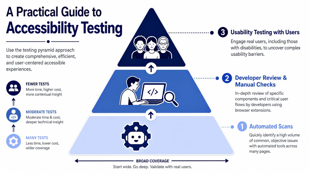
Layer one uses automation for coverage
Automated tools like Axe DevTools, WAVE, Lighthouse, and platform scanners are good at finding detectable issues quickly. They help teams catch missing alt attributes, empty buttons, some contrast failures, missing form labels, and structural problems across many pages.
That makes them valuable in WordPress because you can scan templates, archives, product pages, blog posts, and checkout variants efficiently. They’re especially useful after theme changes, plugin updates, or a redesign.
But they have limits.
Layer two uses manual testing for behavior
Manual review is where many blockers show up. Use only a keyboard. Tab through the header, menus, search, filters, accordions, forms, cart, account area, and checkout. Increase browser zoom. Test on a phone. Trigger validation errors. Open every modal and dismiss it.
The point isn’t to mimic a formal audit in-house. The point is to catch the issues automation misses, especially around interaction and focus management. Teams working with page builders often need extra scrutiny here, and this Elementor accessibility guide is a practical reference when builder-driven layouts introduce accessibility debt.
Layer three tests critical paths with real users
This is the step that changes priorities fastest. The research is clear that a single inaccessible step can completely block a user, and automated checks can miss nuanced barriers, while even a “clean” report doesn’t prove accessibility. In other words, if your add-to-cart flow, appointment booking, donation form, or account login has one inaccessible interaction, the journey fails.
A clean scan is a maintenance signal, not proof that people can use the site.
For WordPress organizations with active remediation work, a formal review process helps. Teams that need a structured baseline often start with WCAG compliance audits, then use recurring checks in QA to keep regressions from shipping.
A practical testing stack usually looks like this:
- Automated scans for broad pattern detection across templates
- Manual keyboard checks for navigation, forms, modals, and focus order
- Screen reader spot checks on high-value workflows
- User validation for critical journeys where failure has direct business impact
Prioritized Fixes for WordPress and WooCommerce Sites
Most WordPress accessibility work should start with the pages and components that drive action. Don’t begin with obscure templates if your menu, forms, product pages, and checkout still have blocking issues.
Fix the WordPress foundation first
Theme-level defects multiply across the entire site. If the header nav, skip link, focus styles, heading structure, button states, or form patterns are weak at the theme level, every page inherits the problem.
Start with these priorities:
- Check semantic templates so headings, landmarks, lists, buttons, and links use the right HTML element for the job.
- Restore visible focus states if the theme or plugin CSS removed outlines.
- Audit navigation behavior so dropdowns open and close predictably by keyboard and focus doesn’t disappear.
- Review popups and banners including cookie notices, newsletter modals, and promo bars that often block content or trap focus.
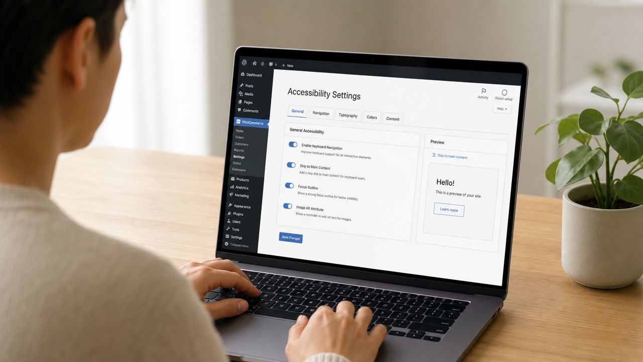
- Set editorial rules in Gutenberg so content teams use real headings, descriptive links, and alt text instead of visual formatting hacks.
For teams building custom blocks, Gutenberg is powerful but unforgiving. A visually polished block can still produce poor markup, weak labels, or inaccessible controls if the block was developed without semantic defaults. If you need implementation help specific to WordPress remediation, ADA compliance for WordPress is the kind of service model teams use when they need audits and code fixes, not just guidance.
Treat Gutenberg as a content system, not just an editor
Many accessibility defects enter through publishing, not engineering. Editors upload hero images with vague alt text, paste “read more” links repeatedly, choose low-contrast button styles, and embed media or documents without considering how they’re announced.
For ecommerce content teams, this is especially important on category pages and product media. A practical guide to alt text for ecommerce brands is useful because product imagery needs to communicate function and variation, not just keywords.
The best alt text for commerce usually explains what matters to a buyer using assistive tech, not what helps fill a field in the CMS.
Fix WooCommerce where conversions are won or lost
WooCommerce stores usually need the deepest review in four places: product options, cart updates, checkout forms, and account flows.
Common remediation priorities include:
Product galleries and thumbnails
Every meaningful image needs useful alt text. Decorative duplicates should stay quiet. Variant imagery should help users distinguish options when the image carries product information.Variation selectors and add-to-cart controls
Swatches, dropdown replacements, and custom quantity controls often fail keyboard use or expose poor names to assistive technology. Native controls are usually safer than heavily scripted replacements.Checkout field labels and errors
Fields need programmatic labels. Required states need to be clear. Errors should identify the problem in text and move users toward resolution without relying only on color or placement.Dynamic cart and checkout updates
Shipping changes, coupon results, stock notices, and inline validation should be announced in a way assistive technologies can interpret.
A short walkthrough helps teams see where these failures often appear in practice:
Be careful with overlay plugins and quick fixes
Accessibility overlay tools and “one-click compliance” plugins are often oversold. They may add toggles or visual adjustments, but they don’t repair broken markup, inaccessible third-party widgets, missing labels, or a checkout flow that fails by keyboard.
What works better is a combination of theme-level remediation, plugin review, editorial standards, and regression testing after updates. That’s slower than installing a widget, but it fixes the actual problem.
Building an Accessible Future Beyond One-Off Fixes
Accessibility has to become part of operations. If you treat it as a one-time cleanup project, new blocks, campaign pages, plugins, and redesigns will recreate the same defects.
The teams that mature fastest usually do three things well. They audit high-risk journeys first. They train both developers and content editors. They add accessibility checks to design review, QA, and release workflows so issues are caught before publishing.
This also changes how work gets scoped. Instead of saying “make the site accessible,” teams define accessibility requirements for navigation, forms, media, documents, ecommerce flows, and custom components. That produces better estimates, fewer surprises, and cleaner accountability across marketing and engineering.
For organizations that need outside support, accessibility audit services can provide a structured starting point. The useful output isn’t just a list of defects. It’s a remediation plan tied to templates, components, and business-critical journeys so teams know what to fix first and how to keep it fixed.
Accessibility done well isn’t separate from growth. It supports discoverability, usability, conversion quality, and trust. On WordPress and WooCommerce sites, that usually starts with fewer assumptions, better testing, and a willingness to fix the parts of the stack that “look fine” but fail real users.
If your WordPress or WooCommerce site has unresolved accessibility issues, IMADO can help assess templates, custom blocks, ecommerce flows, and theme-level defects, then turn findings into practical remediation work your team can ship.